What font should I use for character thoughts in CG sets?
Usually CG sets don't have a speech bubble and in this case all the text has the same font, which makes it difficult to differentiate the normal dialogues from the thoughts of the characters. the characters' thoughts are written inside parentheses, which doesn't help much
so I would like you to suggest to me what I could do to make the thoughts of the characters easier to distinguish.
I was thinking I could use a different font for the thoughts, which one would you recommend?
[b]so I would like you to suggest to me what I could do to make the thoughts of the characters easier to distinguish.
How about using italics?
Personally I think parentheses are sufficient and clear markers. When the majority of the text is understood to be being spoken out loud, then parentheses will naturally be thoughts or a narrator's voice like "(A short while later...)."
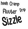
Anyone has a copy of Wildwords to provide me? (Not Lower nor Roman versions) I just learned I missed the sale and I kinda want to get my hands on it while waiting for another sale to buy it.


 Jul 25 2022, 23:01