|
 |
 |
 Red's, Dlaglacz's and friends Dragon Pink bounty thread Red's, Dlaglacz's and friends Dragon Pink bounty thread, Bringing you another blast from the past (Dlag-powered bounties!) |
|
 Mar 21 2012, 12:51
|
Dlaglacz
Group: Catgirl Camarilla
Posts: 7,899
Joined: 6-March 08

|
Repeating the entire word during such stuttering seems strange to me in general, but Japanese do it in manga, anime, and possibly in real life as well. I just don't get it - when they're supposed to be amazed enough for the brain to be unable to continue the flow of words, how is the brain able to roll a bit back and repeat the last word said clearly?
I understand it's a Japanese way of showing amazement, a cultural thing. But in English its equivalent would probably be at most repeating the last vowel? I don't know. If "That... That is..." was to sound reallistic for native English speaker who knows nothing about Japan, perhaps it should contract to just "That'ss..", without word repetition?
Maybe Japanese do it because for them such word is as if in kanji, a single character, and they can go back no less than that... no idea really.
Just my general thought on a very minor point, I'm happy both with Japanese way of stating amazement, and English one, so I don't much care which is chosen.
|
|
|
|
|
 |
|
Mar 21 2012, 18:04
|
Red of EHCOVE
Group: Gold Star Club
Posts: 9,493
Joined: 28-April 07
|
With v16 done, are there any fixes we want to do apply to any pages before the collected volume is released?
I got fixed pages 67 and 74.
Also, there was talk of fixing some pages in v1?
|
|
|
|
Mar 21 2012, 18:13
|
Kaosumx
Group: Gold Star Club
Posts: 3,362
Joined: 20-February 12
|
I just realized...how come I'm the only one that included the cover page for each chapter instead of starting at "Begin Adventure".
EDIT - nvm, only 13,14,15 didn't include that page.
This post has been edited by Kaosumx: Mar 21 2012, 18:13
|
|
|
|
|
|
|
Mar 21 2012, 18:46
|
PeopleDon'tDanceNoMore
Group: Members
Posts: 2,523
Joined: 29-February 08
|
QUOTE(Red_Piotrus @ Mar 21 2012, 11:04)  Also, there was talk of fixing some pages in v1?
This: QUOTE(PeopleDon'tDanceNoMore @ Mar 9 2012, 07:35)
And might an editor be willing to reedit "Ener Psy Burst" in ep 6 (pg 106, according to the bottom-right of the page) and "Psy Burst" in ep 4 (pg 60, same)? I can put up a bounty or just transfer a small reward if you like.
And this post was where I listed some fixes for ep7-12 (with responses from jfj here and here (first only). I don't know which of those you might have gotten corrections for already, Red, or which haven't been done yet. If I can see ep16, which doesn't seem to be released right now (private gallery or ddl link?), I'll look over 13-16 all at once. |
|
|
|
|
|
|
Mar 21 2012, 18:51
|
Kaosumx
Group: Gold Star Club
Posts: 3,362
Joined: 20-February 12
|
QUOTE(PeopleDon'tDanceNoMore @ Mar 21 2012, 12:46) This: And this post was where I listed some fixes for ep7-12 (with responses from jfj here and here (first only). I don't know which of those you might have gotten corrections for already, Red, or which haven't been done yet. If I can see ep16, which doesn't seem to be released right now (private gallery or ddl link?), I'll look over 13-16 all at once. It's right there and on the front page? |
|
|
|
|
|
|
Mar 21 2012, 18:55
|
PeopleDon'tDanceNoMore
Group: Members
Posts: 2,523
Joined: 29-February 08
|
QUOTE(Kaosumx @ Mar 21 2012, 11:51) I searched "Dragon Pink" (w/o quotes) and it's still not there right now. I guess the system takes a little while to update (if that's UTC time, that was less than an hour ago, so that's reasonable I guess). Edit: And now it's there, just over an hour later, or past the hour...I don't know which may have been the key. ...fwiw. This post has been edited by PeopleDon'tDanceNoMore: Mar 21 2012, 19:12 |
|
|
|
Mar 21 2012, 19:05
|
jfji552
Group: Gold Star Club
Posts: 178
Joined: 19-June 08
|
The font used in the table of contents really sticks out. Is there any chance you could replace it with one that's more similar to the entries for the regular chapters? Maybe make it a bit bigger too, at least the "Creation collection" one. |
|
|
|
Mar 21 2012, 19:17
|
PeopleDon'tDanceNoMore
Group: Members
Posts: 2,523
Joined: 29-February 08
|
QUOTE(jfji552 @ Mar 21 2012, 12:05) The font used in the table of contents really sticks out. Is there any chance you could replace it with one that's more similar to the entries for the regular chapters? Maybe make it a bit bigger too, at least the "Creation collection" one. Quick thought: that "title"/listing for the Idea contest could be trimmed down a bit, too. Perhaps, "Participant Register for 2nd, 3rd Idea Contest" (maybe "Contests", maybe "2nd and 3rd")? |
|
|
|
|
|
|
Mar 21 2012, 19:18
|
Kaosumx
Group: Gold Star Club
Posts: 3,362
Joined: 20-February 12
|
QUOTE(jfji552 @ Mar 21 2012, 13:05) The font used in the table of contents really sticks out. Is there any chance you could replace it with one that's more similar to the entries for the regular chapters? Maybe make it a bit bigger too, at least the "Creation collection" one. Yeah sure, I didn't really like it either. I tried looking for a good font, downloaded like 10 and tried them all but none of them really fit. The thing is that the line is just really really long. EDIT @PeopleDon'tDanceNoMore - yeah that would be a good idea. I don't a font exists that could reasonably fit all of the current text in without some serious streching or being smaller and sticking out. I could just replace all the words in the table of contents though. This post has been edited by Kaosumx: Mar 21 2012, 19:23 |
|
|
|
|
|
|
Mar 21 2012, 19:24
|
jfji552
Group: Gold Star Club
Posts: 178
Joined: 19-June 08
|
QUOTE(PeopleDon'tDanceNoMore @ Mar 21 2012, 20:17)
Quick thought: that "title"/listing for the Idea contest could be trimmed down a bit, too. Perhaps, "Participant Register for 2nd, 3rd Idea Contest" (maybe "Contests", maybe "2nd and 3rd")?
Sounds like a good idea. Anyway, I don't really mind if the font for that one line is smaller than the other, it should just look more like that of the other lines. Replacing the whole thing sounds a bit less nice, but at least it would make everything consistent. |
|
|
|
|
|
|
Mar 21 2012, 19:29
|
PeopleDon'tDanceNoMore
Group: Members
Posts: 2,523
Joined: 29-February 08
|
It looks like LS did the TOC for volume 1, so you might ask what he used. "Part 1" and "Part 2" look a little different, but "Creation Collection" looks almost perfect. edit: Maybe he just copied individual letters from the raw font? It's doable, by what's in that TOC, but idk what he actually did. edit2: And except for a lack of comma (use "and" instead?), you could do that for the Idea contest line. "F" ("for") is only in the vol 1 TOC, but between the vol 1 and vol 2 TOC's you could definitely piece that line together. It looks like vol 1 doesn't contain a "3" (3rd) either, so you wouldn't be able to get the whole line from one raw, but that can be solved by a little scaling (and some more to get the whole line to fit at the end). This post has been edited by PeopleDon'tDanceNoMore: Mar 21 2012, 19:38 |
|
|
|
|
|
|
Mar 21 2012, 19:36
|
Kaosumx
Group: Gold Star Club
Posts: 3,362
Joined: 20-February 12
|
QUOTE(PeopleDon'tDanceNoMore @ Mar 21 2012, 13:29) It looks like LS did the TOC for volume 1, so you might ask what he used. "Part 1" and "Part 2" look a little different, but "Creation Collection" looks almost perfect. edit: Maybe he just copied individual letters from the raw font? It's doable, by what's in that TOC, but idk what he actually did. Yeah that looks like he clones the thing letter by letter. EDIT - Creation Collection done. Working on "Participant Register for 2nd, 3rd Idea Contests". now. Also cleaned up some of the gray crap I missed in my leveling. EDIT2 - Participant Register for 2nd, 3rd Idea Contests" is almost done too. Will need to be shrunk a bit though to get it to fit. This post has been edited by Kaosumx: Mar 21 2012, 20:40 |
|
|
|
|
|
|
Mar 21 2012, 21:29
|
Kaosumx
Group: Gold Star Club
Posts: 3,362
Joined: 20-February 12
|
Done. I now hate collages about 500 percent more. >.> Oh the memories.  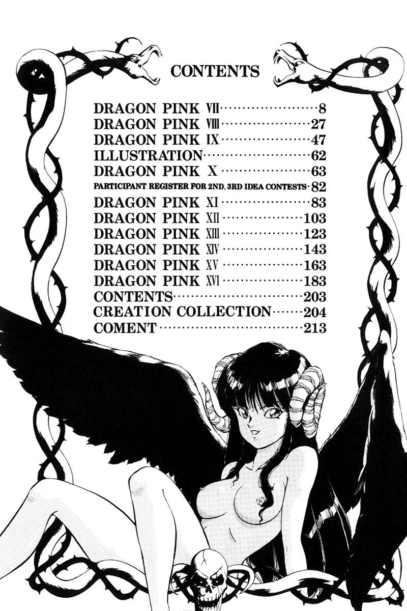 |
|
|
|
|
|
|
Mar 21 2012, 23:53
|
PeopleDon'tDanceNoMore
Group: Members
Posts: 2,523
Joined: 29-February 08
|
Nice, Kaosumx. Fixes/suggestions for ep13-16. Edit: jfji552 says okay to most of the suggestions (partially, where the quote is inserted below). (EPISODE 13...) 125 Suggestion: how about "bitch-cat" (or "bitch cat") instead of "you female cat"? It just sounds too bland right now. And since he's talking to her, I rather think you don't need the "you" part. 128 Suggestion: " Oh demon goddess". "Ooh" just sounds like "oo" (scary!). I understand the raw said 'oo', but it's more a sound of appreciation/reverence and doesn't cross the language barrier well, just as it is. If you want to translate it a bit farther so the reverence or whatever comes through better, ok; but not just "ooh". Suggestion: " Here, please enjoy". "Here" sounds a bit less formal there, and you don't really need it. 130 unnoted sfx left of door: *thud* 136 Pink's wail: there's no need to follow the raw that closely here; it looks worse than it needs to. Put them one on top of the other instead of side-by-side. (EPISODE 14...) 152 Why does the *pour* sfx have the latter asterisk below "pour"? "You think that's what we 'll do?" (or "what we will do?", but the original script seems to say "we'll" (although no "do" still)). 155 Split it "Yuari/slime", not "Yuaris/lime". (Pink's last bubble.) (EPISODE 15...) 166 "Damn you! Let Santa gooo!" 170 "hard-to-kill bastard" (add hyphens). 172 "uohryaaa", one word, which means put a hyphen where the comma was if it needs to be split. Making it two separate "words" is just weird... 173 Suggestion: "The money purse saved me." That's not a wallet. You could use some other words than "money purse", though... QUOTE(jfji552 @ Mar 26 2012, 17:22)
Let's go with "money purse"
175 Suggestion: " I will drive you even crazier." He's actually saying he will, so it's "I". And then "crazy even more" is too round about. 178 Suggestion: "This isn't just any old penis." And "or" in the latter part of that dialogue is a little weird...what about, "The number of women it's driven mad is more than just 10 or 20." ? QUOTE(jfji552 @ Mar 21 2012, 18:36) Fine with the "old", [...] QUOTE(jfji552 @ Mar 26 2012, 17:22) "More than 10 or even 20 women have been driven to madness by it.", although I think [it] could be left as is just as well. Your choice, I'd say. 180 Suggestion: "I'll just eat you up, bones and all." Putting "just" in there is a bit odd, and not necessary. "heh/ehe" -> ...something split between e and h: "he/hehe" or "hehe/he". If you don't want it to look like "he" (him) just put a hyphen before or after (depending; the first option might be better for that: "he-"). (EPISODE 16...) 185 Semen's first bubble, maybe it's the relatively small font size, but the letters are pretty crowded together. It's worst in YUARISLIME which looks like YUARISUME (I almost can't even tell the difference between the U and the LI), and similarly annoying in "troubling" (though troubling is a real word, so it's easier to catch on). The rest of it would benefit from a little more spacing, but isn't a terrible bother as is. 189 "Pink, you're a cat" 195 "The magic-sealing symbols" 196 Suggestion: " Please don't just count us as dead , okay?" "Please" isn't really in the original line, and both that and "okay" muddle the line more than necessary. 197 Suggestion: "O souls that inhabit the atmosphere, suck out the blood of those I enclose." I think 'kakoisi hai' is "those (who are) enclosed" (i.e., who she designates by enclosing with her magic...more or less). Maybe "shall enclose" to make it sound a little better. 198 The "note"...don't write "note", that looks too much like our TL note; just use the symbol at the start of the raw line. And remove "it" from the tl'd line. 199 "I... I won't die like this!" 200 Suggestion: "You say it's a clue, but..." I didn't know where this was before, but I actually agree that "say" would be better. 204 I think you should just replace the Japanese with the English "Dragon Pink", instead of overlaying it. And it'd be neat to put a <3 on top of the I (or i) like the Japanese has in it. 213 Why is "being", at the bottom, capitalized? 214 Put some space before "I'm very sorry!" And if any of this isn't done, ep7-12 (with jfj's responses added in)... QUOTE(PeopleDon'tDanceNoMore @ Mar 11 2012, 20:56) (EPISODE 7...) 008 Remove the asterisks around "Nope" and "Cheapskate". ...Kinda don't know why I wrote them like that, I should've done that better. 010 The asterisks here, on "Cat Slave", are supposed to denote emphasis. Could you underline it maybe? If it doesn't look good, it's not that important , but the asterisks should be removed either way. 018 Okay, "go- -od" doesn't look as good as I hoped, could you change it to "go--od"? And the SFX are only supposed to be "ch" (no "u"). 024 Take out the slash in ZZZ/HYOO, and if they're going to be separated like that, either take out the asterisks or put one on each side of both parts. (EPISODE 8...) 031 I guess you trimmed "cummingg" to fit on one line, but it needs two m's. "cumming" at least. Maybe you could just split it, cumm- / ingg ? 032 The parenthesized parts were only supposed to indicate what was hidden by foreground (some of them are only partially hidden, so sometimes I figure the editor might want to get a little fancy). Take out anything in parentheses. And I think it'd look a little better if those laughs were a little more evenly spaced across the vertical space; just lowering HAHA should be fine. 039 I missed an SFX! *pachi pachi* by the torch is *crackle*. (EPISODE 9...) 053 Periods do not get orphaned on the next line. "within the atmosphere." 056 Ena Saibus -> Ener Psy Burst (EPISODE 10...) More a comment, but that double page either needs to be much better or dropped. It looks like the separate halves may not come to the exact middle, so a join may not even be possible. 067 Unedited bubble. 074 Unmarked sfx? (Top-left.) (EPISODE 11...) 082 "Aus"...? QUOTE(jfji552 @ Mar 12 2012, 09:29) "Taa-kun from Kawai" (Kawai is a [ en.wikipedia.org] town in the Kansai region.) 086 Punctutation (comma): "It's written on the map, too." 088 "You-know-what" (Pink)...either both hyphens get doubled or none of them do. Right now it's inconsistent. Actually, it's inconsistent with how it was typeset for Pierce, just before, which didn't double either hyphen. "Hyoeeh"...maybe manually redraw that "H", or something, but right now it looks like "U". suggestion: "You thundering idiot!" I just don't like the sound of "giant idiot". 089 strong suggestion: "Expecting...P-Pierce [etc]" "A matter for congratulation" doesn't work at all. Could also go with the alternate to "matter..." from the dictioary, "happy event" (more literal to the raw phrase than "expecting"), if you want, but that's not great either...but not too bad, at least. QUOTE(jfji552 @ Mar 12 2012, 09:29)
Sounds much better, yes.
096 "Hieeeh", that "H" again...it's not too bad here, but I think it'd be nice if it looked more like an "H". 099 "No, way I did". That comma's bad punctuation (remove it). The wording is also weird, but jfj can decide if he wants to change it. QUOTE(jfji552 @ Mar 13 2012, 15:31)
Okay. Maybe contract it to: "No, I haven't!"
(EPISODE 12...) 107 suggestion: "Heh!?" (but that looks like laughter) or "Hwe!?" or just "Huh!?", but not "He!?"; impromptu grunts shouldn't look/sound like words IMO ("he", as in "him"). QUOTE(jfji552 @ Mar 12 2012, 09:29)
Let's make it "Hwe!?".
108 "make into money" 109 That splitting of "Hon/eymoon" in the last bubble feels weird. There seems to be room for another line, so why not just start Honeymoon on the next line and then split it "Honey/moon" (unless you don't have to split it)? 117 "The hell're you doing!?" |
|
|
|
|
|
|
Mar 22 2012, 00:11
|
lightshader
Group: Gold Star Club
Posts: 1,350
Joined: 29-August 09
|
Yikes... chapter 16's done and released? Better get around to fixing those errors pointed out in my chapters soon. (IMG:[ invalid] style_emoticons/default/heh.gif) This post has been edited by lightshader: Mar 22 2012, 00:14 |
|
|
|
|
|
|
Mar 22 2012, 00:26
|
Kaosumx
Group: Gold Star Club
Posts: 3,362
Joined: 20-February 12
|
QUOTE(PeopleDon'tDanceNoMore @ Mar 21 2012, 17:53)
Nice, Kaosumx.
Thanks QUOTE
(EPISODE 16...)
185
Semen's first bubble, maybe it's the relatively small font size, but the letters are pretty crowded together. It's worst in YUARISLIME which looks like YUARISUME (I almost can't even tell the difference between the U and the LI), and similarly annoying in "troubling" (though troubling is a real word, so it's easier to catch on). The rest of it would benefit from a little more spacing, but isn't a terrible bother as is.
Easy fix QUOTE
189
"Pink, you're a cat"
Agreed. Should have just changed that at the start. Its rare for people to actually say each word in a contraction. EDIT - Also, it kept bothering me that Santa assumed Pink would be to see in the dark because of the smoke/ink in the air. It's night vision, not X-Ray vision! And then I got into where the light source in that castle came from.... QUOTE
195
"The magic-sealing symbols"
That somewhat changes the connotations from the symbols being magical to more of the symbols sealing magic specifically. Minor different but I guess it works somewhat better. QUOTE
196
Suggestion: "Please don't just count us as dead, okay?" "Please" isn't really in the original line, and both that and "okay" muddle the line more than necessary.
I've been trying to think of a better way to say that sentence, but nothing really worked for me. Don't just count us as dead! is still a bit awkward imo. Mainly the count part. QUOTE
198
The "note"...don't write "note", that looks too much like our TL note; just use the symbol at the start of the raw line. And remove "it" from the tl'd line.
I'm ok with that change. The ... should probably go too then. QUOTE
199
"I...I won't die like this!"
That totally changes the meaning of the sentence. QUOTE
200
Suggestion: "You say it's a clue, but..." I didn't know where this was before, but I actually agree that "say" would be better.
I suggested that. jfji argued against it. QUOTE
204
I think you should just replace the Japanese with the English "Dragon Pink", instead of overlaying it. And it'd be neat to put a <3 on top of the I (or i) like the Japanese has in it.
I tried that first, but it looked kind of awkward. I probably need to find a new font for that. It would also mean that I probably should replace the (Secret) Creation Collection too. If I had seen the <3. I probably would have added one to the English overlay. QUOTE
213
Why is "being", at the bottom, capitalized?
That's the font, not me. Augie font has the B capitalized for upper and lower case, Upper case b is much bigger though. QUOTE
214
Put some space before "I'm very sorry!"
Okay I'd look over the other galleries and make suggestions too, but my router didn't like the firmware upgrade I gave it so its speed has gone to about 50kbps tops. This post has been edited by Kaosumx: Mar 22 2012, 00:31 |
|
|
|
|
|
|
Mar 22 2012, 00:36
|
PeopleDon'tDanceNoMore
Group: Members
Posts: 2,523
Joined: 29-February 08
|
QUOTE(Kaosumx @ Mar 21 2012, 17:26)
That somewhat changes the connotations from the symbols being magical to more of the symbols sealing magic specifically. Minor different but I guess it works somewhat better.
The symbols may have been magic themselves, but the distinction here was that they were sealing her magic. QUOTE EDIT - Also, it kept bothering me that Santa assumed Pink would be to see in the dark because of the smoke/ink in the air. It's night vision, not X-Ray vision! And then I got into where the light source in that castle came from.... Eh...cats need less light. Possibly that means they could see where smoke obscures enough light so that we can't see. It's also possible that was more magical than actual smoke so it really made it more like night than smoky. QUOTE I've been trying to think of a better way to say that sentence, but nothing really worked for me. Don't just count us as dead! is still a bit awkward imo. Mainly the count part. *shrug* It's fine by me. I could reword it, too, but maybe jfj would like to suggest something. QUOTE I'm ok with that change. The ... should probably go too then. The ellipsis after "Dead Dieter" follows the raw, don't take it out. QUOTE That totally changes the meaning of the sentence. Yes. Because it was the wrong meaning. I should have made that clearer. =/ QUOTE I suggested that. jfji argued against it. I know. =) Maybe he'll reconsider this time. QUOTE I tried that first, but it looked kind of awkward. I probably need to find a new font for that. It would also mean that I probably should replace the (Secret) Creation Collection too.
If I had seen the <3. I probably would have added one to the English overlay. This is more a suggestion than the others, so if you think it's better/easier as is, I don't mind it that much. QUOTE That's the font, not me. Augie font has the B capitalized for upper and lower case, Upper case b is much bigger though. Then change the font? Or manually erase part of it so it looks lowercase. This post has been edited by PeopleDon'tDanceNoMore: Mar 22 2012, 00:40 |
|
|
|
|
|
|
Mar 22 2012, 01:36
|
jfji552
Group: Gold Star Club
Posts: 178
Joined: 19-June 08
|
Regarding script changes: QUOTE Suggestion: how about "bitch-cat" (or "bitch cat") instead of "you female cat"? It just sounds too bland right now. And since he's talking to her, I rather think you don't need the "you" part. Doesn't that sound a bit funny, with the dog/cat-word mixing? Well, I don't really mind. QUOTE 128
Suggestion: "Oh demon goddess". "Ooh" just sounds like "oo" (scary!). I understand the raw said 'oo', but it's more a sound of appreciation/reverence and doesn't cross the language barrier well, just as it is. If you want to translate it a bit farther so the reverence or whatever comes through better, ok; but not just "ooh".
Suggestion: "Here, please enjoy". "Here" sounds a bit less formal there, and you don't really need it.
130
unnoted sfx left of door: *thud*
(EPISODE 14...)
152
"You think that's what we'll do?" (or "what we will do?", but the original script seems to say "we'll" (although no "do" still)).
(EPISODE 15...)
166
"Damn you! Let Santa gooo!"
170
"hard-to-kill bastard" (add hyphens).
172
"uohryaaa", one word, which means put a hyphen where the comma was if it needs to be split. Making it two separate "words" is just weird...
173
Suggestion: "The money purse saved me." That's not a wallet. You could use some other words than "money purse", though...
175
Suggestion: "I will drive you even crazier." He's actually saying he will, so it's "I". And then "crazy even more" is too round about. Okay. QUOTE 178
Suggestion: "This isn't just any old penis." And "or" in the latter part of that dialogue is a little weird...what about, "The number of women it's driven mad is more than just 10 or 20." ? Fine with the "old", the other one sounds odd to me. QUOTE 180
Suggestion: "I'll just eat you up, bones and all." Putting "just" in there is a bit odd, and not necessary. Okay, although I liked it the way it was. QUOTE (EPISODE 16...)
189
"Pink, you're a cat"
195
"The magic-sealing symbols"
196
Suggestion: "Please don't just count us as dead, okay?" "Please" isn't really in the original line, and both that and "okay" muddle the line more than necessary.
197
Suggestion: "O souls that inhabit the atmosphere, suck out the blood of those I enclose." I think 'kakoisi hai' is "those (who are) enclosed" (i.e., who she designates by enclosing with her magic...more or less). Maybe "shall enclose" to make it sound a little better. Okay. QUOTE 198
The "note"...don't write "note", that looks too much like our TL note; just use the symbol at the start of the raw line. And remove "it" from the tl'd line. You can also use this: ※ QUOTE 199
"I...I won't die like this!" Okay. (Agh!) QUOTE 200
Suggestion: "You say it's a clue, but..." I didn't know where this was before, but I actually agree that "say" would be better. Okay. |
|
|
|
|
|
|
Mar 22 2012, 02:00
|
PeopleDon'tDanceNoMore
Group: Members
Posts: 2,523
Joined: 29-February 08
|
QUOTE(jfji552 @ Mar 21 2012, 18:36) Doesn't that sound a bit funny, with the dog/cat-word mixing? Well, I don't really mind. Maybe, but I don't think it's too odd. And it sounds much better than "female cat"; there's just no way someone will say that IMO. "Whore" or "slut" (-cat) would probably be the next best I could think of, but that adds a lot more connotation. |
|
|
|
|
|
|
Mar 22 2012, 03:54
|
lightshader
Group: Gold Star Club
Posts: 1,350
Joined: 29-August 09
|
Almost done editing, just one thing: QUOTE
173
Suggestion: "The money purse saved me." That's not a wallet. You could use some other words than "money purse", though...
Wouldn't money pouch fit better? And also, since we're replacing "wallet" I'll replace them on page 106 while I'm at it too. QUOTE QUOTE
178
Suggestion: "This isn't just any old penis." And "or" in the latter part of that dialogue is a little weird...what about, "The number of women it's driven mad is more than just 10 or 20." ?
Fine with the "old", the other one sounds odd to me. How about "Over 10 or 20 women have been driven to madness by it"? This post has been edited by lightshader: Mar 22 2012, 04:08 |
|
|
|
2 User(s) are reading this topic (2 Guests and 0 Anonymous Users)
0 Members:
|
 |
|
 |
|