Welcome Guest ( Log In | Register )

 
Reply to this topicStart new topic
> Editing Guide Redux, Under Construction

 
post Mar 9 2012, 16:11
Post #1
rookie84


Translator Errant
******
Group: Gold Star Club
Posts: 828
Joined: 23-June 08
Level 308 (Godslayer)


So, there have been a number of forum members wishing to get involved in the scanlating process, whether out of a simple love of hentai or to make some quick E-H money. I put up an editing guide about a year ago, but that's out of date and some images are dead, and I can't be bothered to find them again. So, here's a brand-new guide!

Now, a disclaimer: I an not an expert, and there are many editors out there who are better than me. However, I do consider myself competent enough. If you follow this guide, it will bring you up to my level, which should be enough for you to start taking editing bounties.

This guide is primarily aimed at GIMP users. Photoshop users can go DIAF (IMG:[invalid] style_emoticons/default/laugh.gif) Seriously though, the principles I discuss should be the same for any editing program that uses layers, so Photoshop, GIMP, and Paint.NET are all fine. Don't use MSPaint, it's way too basic for the things an editor has to do.

Okay, enough talk, let's get to editing!
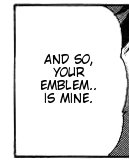
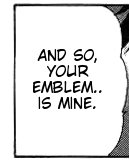
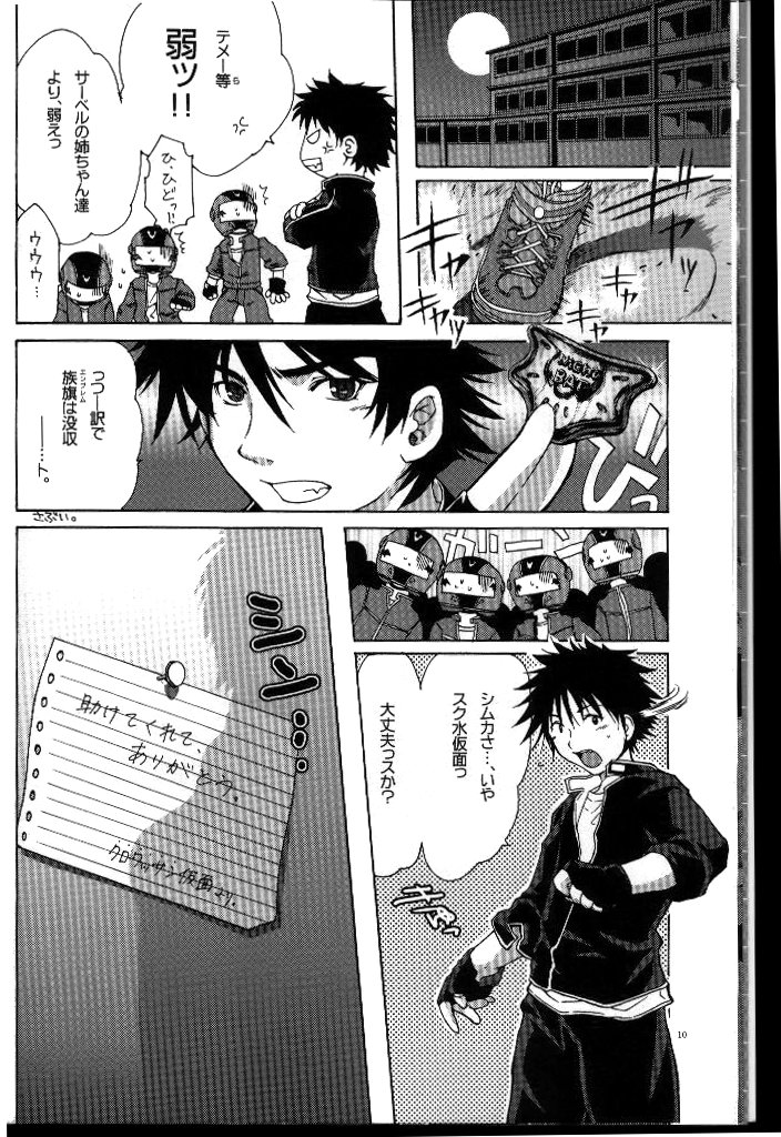
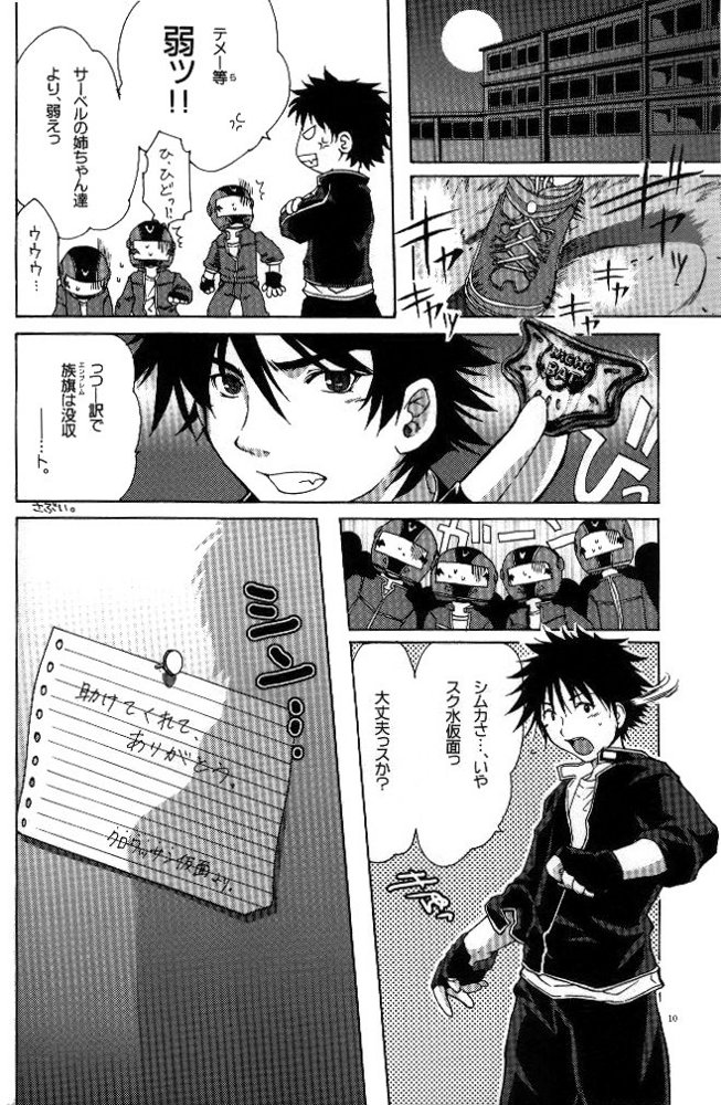
Cleaning

The first step to editing is cleaning. This is mainly fixing up the page so that it looks nice. If you're working with a new doujinshi or manga that's been scanned nicely, there's very little to do, and you can skip this step. Often however, a doujinshi has been scanned improperly, and there's a lot of stuff you need to do to make it look presentable. Let's take this for example.

Attached Image

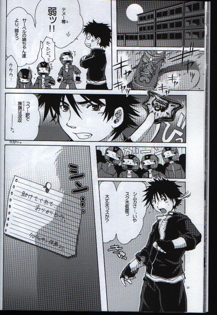
Horrible isn't it? The image is crooked, there's a gray cast, and you can see the edges of the scanned page. But, it's not hopeless, so let's fix this up.

Leveling
The first and most essential step of cleaning is leveling. This basically means to adjust the tones so that parts meant to be white are white and parts meant to be black are black. In GIMP, you open Colors > Levels to get this dialogue box:

Attached Image

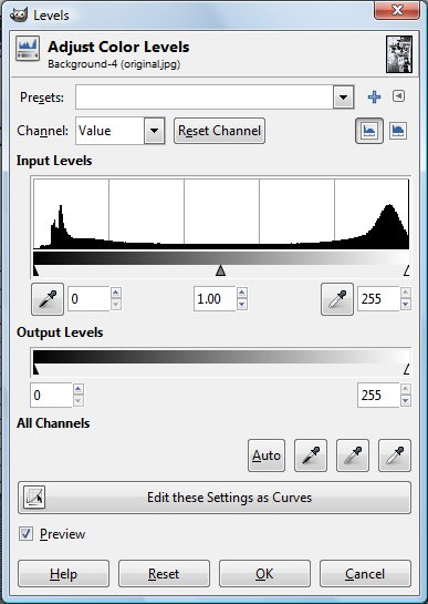
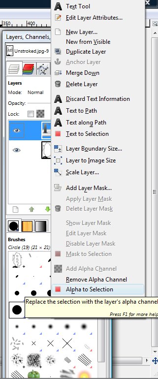
The easiest way to level is to use the eyedroppers. Click on the black eyedropper and then click anywhere on the image that you think should be black, and then click on the white eyedropper and then click anywhere on the image that you think should be white. I usually use the input eyedroppers, I'm not sure what would happen if you use the output ones. Anyway, I choose Ikki's hair to be black and the text bubbles to be white, and I get this:

Attached Image

It's not perfect, the margin is still gray and there are specks in the text bubbles. That's okay though, you don't want to overlevel and start losing details of the image. You fix the gray parts manually by filling them with white and using the eraser. The fill button is the bucket in the toolbox.

Attached Image

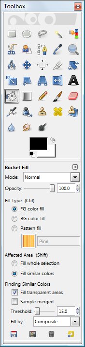
Change the foreground color to white, and adjust the threshold if you want, maybe to 10. I don't care and leave it at 15. Then, fill in the text bubbles and margin to get this:

Attached Image

The eraser button is the one with the pink obloid.

Attached Image

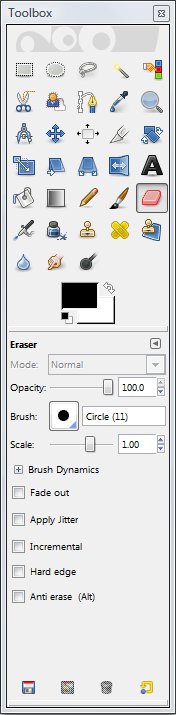
Adjust the brush size and get rid of the last few specks on the margin to get this:

Attached Image

Okay that's it for leveling. The image now looks nice and crisp, but it's still crooked and has those godawful edges on the sides.

Straightening

Let's straighten the image now. First we have to find how crooked the image is. For that, we use the measure tool, which is the compass in the tool box.

Attached Image

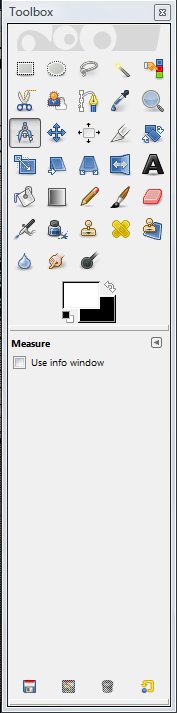
Now, select a line that you think is straight. click on the line, and then drag-click on another part of the line. The measure tool should then tell you the distance and angle between the two points. I do so for the vertical line running parallel to the left margin and get an angle of 89.29 deg, so the image is off by about 0.7 deg. Now I open the Rotate dialog box (Tools > Transform Tools > Rotate):

Attached Image

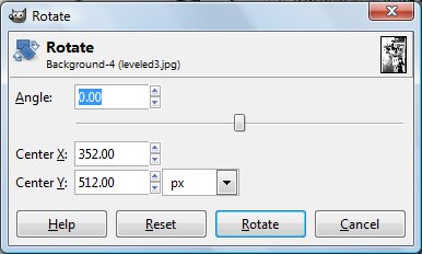
I rotate the image by -0.7 deg (I have to rotate it counterclockwise) to get this:

Attached Image

Cropping

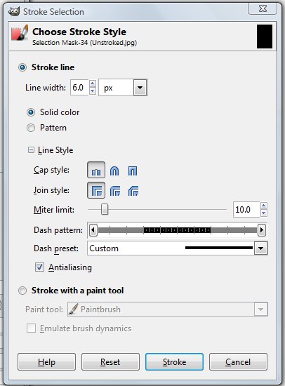
Now let's get rid of the unsightly edges. For this we use the cropping tool, which is the rectangular marquee button in the toolbox.

Attached Image

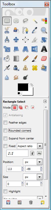
Carefully select the image so that the edges are outside the marquee box, and then crop the selection (Image > Crop to Selection):

Attached Image

You're going to lop off some parts of the actual art, but that can't be helped.

Resizing

Now, the image is pretty much ready, but I decide to be anal and I want all the images in the doujinshi (after all, I'm not going to be editing only a single page) to be the same size. The image is currently 659 x 1009 pixels; I decide (totally arbitrarily) that I want all images to be 660 x 1000 pixels. First, I resize the image so that the height is 1000 pixels by opening the Scale Image dialog box (Image > Scale Image).

Attached Image

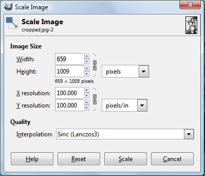
I change the height to 1000 pixels, and the new dimensions of the image are now 653 x 1000 pixels.

Attached Image

Now, how do I get the width from 653 pixels to 660? Scaling the image up is generally a bad idea, so how do you increase the width? Well, there's a white space on the left margin. No one cares if I add some extra space there right? So, I open the Canvas Size dialog box (Image > Canvas Size...).

Attached Image

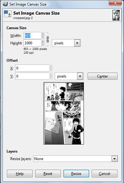
I click on the chain button to unlink the height and width, and then change the width to 660 pixels. I adjust the offset so that the extra space will appear on the left side of the image. I click OK, and then flatten the image (Image > Flatten Image) to get this:

Attached Image

There, the page has now been cleaned. Obviously, not all pages are as bad as this, and you can skip some steps if you don't think they're necessary for the doujinshi you're editing. However, the process I've detailed above should let you handle all but the worst scans.

This post has been edited by rookie84: Mar 9 2012, 16:39
User is offlineProfile CardPM
Go to the top of the page
+Quote Post

 
post Mar 9 2012, 16:12
Post #2
rookie84


Translator Errant
******
Group: Gold Star Club
Posts: 828
Joined: 23-June 08
Level 308 (Godslayer)


Typesetting

When you're typesetting, obviously you need the translated text. Here's a quick translation of the text in the image above.

CODE
テメー等弱ッ!!
サーベルのお姉ちゃん達より、弱えっ
You losers are WEAK!!
You're weaker than the onee-chans from Sabel!

ひ、ひどっ!?
S-so cruel!

ウウウ…
Uuuh..

っつー訳でエンブレムは没収ー…ト
And so, your emblem.. is mine.

さぶい。
Lame.

シムカさ…、いやスク水仮面っ
大丈夫っスか?
Simca-sa.. I mean, School Swimsuit Mask!
You OK?

助けてくれて、ありがとう
Thanks for saving me.

クロワッサン仮面より。
From Croissant Mask.


Essentials

At its core, typesetting is essentially erasing the Japanese text and replacing it with the translated text. In GIMP, you access the text toolbar through the button with the letter A:

Attached Image

Take a look at the settings. Hinting, force auto-hinter, and anti-aliasing should all be checked. You should have the text center-justified for almost everything. You may choose full-justified or left-justified if you're putting down a lot of text (e.g., a plot summary or introduction), but dialogue should pretty much always be center-justified.

When you're placing the text, things to look out for are the shape of the text and the size. In general, try to keep the text roughly mirroring the shape of the text bubbles. Most bubbles are oval in shape, so you generally want your text to look like the left rather than the right:

Attached Image Attached Image

You don't want to overcrowd the bubble, nor do you want to make the text too small. Here are examples where the text is too big, too small, and just right (think Goldilocks and the Three Bears):

Attached Image Attached Image Attached Image

In general, try to find a size that you can use consistently for regular text throughout the doujinshi. This way, not only do you not have to keep on fiddling with the size for each individual bubble, you can increase or decrease the size to let the reader know that the character is talking louder or softer.

For long words, you may have to hyphenate them in order to fit them into the text bubble. Break words up in logical places, like at the end of syllables, rather than in weird places that ruin the flow of the text. So, the left is good while the right is bad:

Attached Image Attached Image

Stroking Text

Stroking text simply means placing a line of color around some text (usually white for black text, black for white text) for better contrast. You usually do this when the text is on the background, or if the text bubble is too small and the text will go over the lines. For example, I'm going to stroke the text here rather than hyphenate to try to make it fit the bubble:

Attached Image

To do so manually, right-click the text layer in the Layers dialog box to open up a menu and select Alpha to Selection:

Attached Image

Then open Edit > Stroke Selection to open up this dialog box:

Attached Image

You can select either Stroke line or Stroke with a paint tool. For the former, you select the line width and other styles; for the latter, you use whatever brush you've selected in the Brush dialog box. Assuming that I have white as the foreground color and black as the background color, I decide to use a line width of 5 pixels and the middle cap and join styles, and I get this:

Attached Image

Then I open Edit > Fill with BG Color to get this:

Attached Image

If you want to do this automatically, then download and install [registry.gimp.org] this plugin. You can then stroke the text by going through Script-Fu.

Font selection

Selecting a good comic font is very important to making the edit look good. Don't use something lame like Comic Sans. Even worse, don't use fonts you'd normally use in word processing like Times New Roman or Arial. Wild Words is commonly used in scanlating and a very good choice if you're just starting out. When you've gained some more experience, you can try experimenting with other fonts to find one you like the most.

You can use the same font for all the text, but most editors like to mix things up to reflect the differences in the original text. For the page we're working on here, I'll use a regular comic font like Wild Words for the typed text, a handwritten font like Another for the handwritten text in the bubbles, and a different handwritten font like TrashHand for the note. I erase the Japanese text, put in the English translation, and I get this:

Attached Image

At this point, you should be able to edit at least 80% of any given doujinshi. I'll talk about how to handle the last 20% in the next sections.

This post has been edited by rookie84: Mar 9 2012, 21:41
User is offlineProfile CardPM
Go to the top of the page
+Quote Post

 
post Mar 9 2012, 16:12
Post #3
rookie84


Translator Errant
******
Group: Gold Star Club
Posts: 828
Joined: 23-June 08
Level 308 (Godslayer)


Advanced

Under construction

This post has been edited by rookie84: Mar 9 2012, 16:40
User is offlineProfile CardPM
Go to the top of the page
+Quote Post

 
post Mar 9 2012, 16:12
Post #4
rookie84


Translator Errant
******
Group: Gold Star Club
Posts: 828
Joined: 23-June 08
Level 308 (Godslayer)


Miscellaneous

Under construction

This post has been edited by rookie84: Mar 9 2012, 16:40
User is offlineProfile CardPM
Go to the top of the page
+Quote Post

 
post Mar 9 2012, 23:49
Post #5
Super Shanko


Manga Handyman
*********
Group: Members
Posts: 5,594
Joined: 29-June 08
Level 199 (Lord)


If you're open to suggestions. The paint bucket can be heavy handed and the eraser (while very good) can be time consuming. What I found works is using the magic wand (or similar) to fill in he bubble along the edges and level out the debris.
User is offlineProfile CardPM
Go to the top of the page
+Quote Post

 
post Mar 9 2012, 23:54
Post #6
rookie84


Translator Errant
******
Group: Gold Star Club
Posts: 828
Joined: 23-June 08
Level 308 (Godslayer)


Sure, whatever works. I tend to use the fill only outside the margins and inside text bubbles; that is, where there's a big thick line to stop the fill from going any further. Using it where there is a gradient or pattern is definitely not a good idea. Another way of doing it is using the dodge tool and setting it to only lighten the highlights.
User is offlineProfile CardPM
Go to the top of the page
+Quote Post


Reply to this topicStart new topic
1 User(s) are reading this topic (1 Guests and 0 Anonymous Users)
0 Members:


Lo-Fi Version Time is now: 29th March 2024 - 03:36