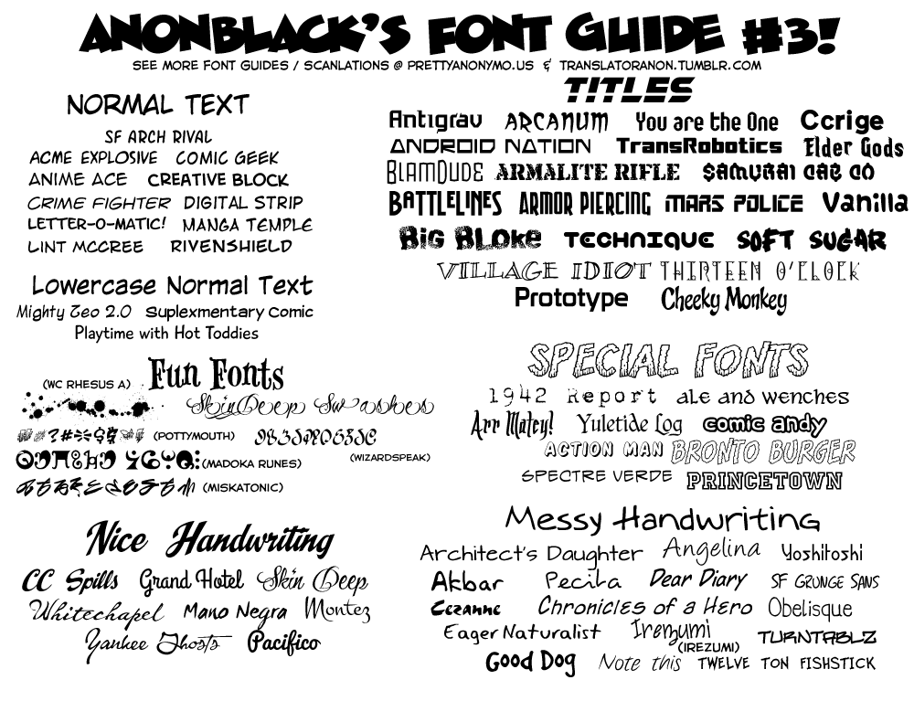
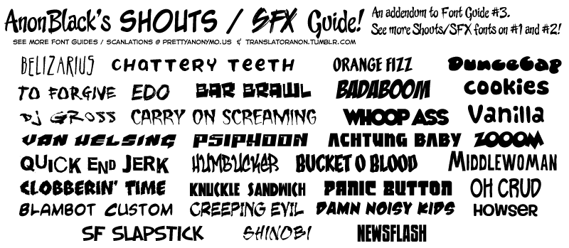
I don't like these AnonBlack Font Guides because they have bizarre suggestions (Zud Juice for Shouts/SFX instead of Normal Text? Wild Words Lower as Normal Text? SilverAge LC for Normal Text?) that will mislead people. I mean, do people even question the lack of authority of them?
For the most recent typesetting job I did, the primary moan fonts I used were [
www.dafont.com]
Buffalo Stance¹ for thicker moans, [
www.dafont.com]
Lipsum² for thinner and pointy ones, [
www.dafont.com]
Stylewars 2011 to mix things up, and [
www.dafont.com]
All Things Pink as another thin font.
¹ This is the trial version so it's missing special characters and some punctuation, but those usually aren't needed anyway.
² Lipsum works well as a moan font, but doesn't look so good as a sex talk font. You may recognize it as
Mikakunin's sex talk font of choice.
@Ser_Maggot
I guess what I mean to say is, people should trust their eyes, not some random guides. If the font looks bad for the way it's used, don't force it. I'll grant that they may be a helpful starting point for people with a nonexistent font library.
This post has been edited by freudia: Jul 4 2014, 02:23


 Jun 11 2014, 05:14