Loading. Please Wait... 
 |
 |
 |
 Comprehensive Editing Guide Comprehensive Editing Guide, Because people keep saying it would be a good idea... |
|
 Oct 16 2010, 11:27
|
rookie84
Group: Gold Star Club
Posts: 828
Joined: 23-June 08

|
Okay, so EHT says they need editors, and there are quite a few posters who say they'd like to become editors to help speed up the translation process if they just knew how. There are guides to editing [ senbonzakura.kageyoshi.net] here, here, and [ www.unblessed.net] here, but in case people are too lazy to click those links, I figure we can use this thread as a guide to train people up to speed. Okay, first off, I assume that you have some editing software more powerful than MSPaint. The most popular ones are Photoshop, GIMP, Paint.net, etc. Note that I use GIMP, so things may be a little different for Photoshop users, but the basic concepts should be the same. CleaningFirst up is cleaning. I generally use four steps, though only the first is really necessary for most purposes. Step 1: LevelingThe first thing you should do when editing a doujinshi is check if it needs leveling. Sometimes you're lucky and you don't need to, but often there's a grayish cast to the image, or there's a faint outline of the reverse in the background. This really needs to be eliminated to make the image look nice. See below for an example. (IMG:[ sadpanda.us] http://sadpanda.us/images/265605-7RKFD0B.jpg) The best way to do this is through leveling. Open the Levels dialog box (Colors > Levels in GIMP). (IMG:[ sadpanda.us] http://sadpanda.us/images/265607-0670UE0.jpg) The simplest way is to click on the black point picker (button with eyedropper filled with black) and then click on a point in the image you think should be black, and then do the same on a point you think should be white for the white point picker. (Use the eyedroppers for the input level, not output.) I do so, and I get this. (IMG:[ sadpanda.us] http://sadpanda.us/images/265608-3NW9SCU.jpg) Note: Pick a point in the middle of the image. There may be distortions at the edges of the images, which can cause you to overlevel. Step 2: RotatingNow, if you've noticed, this image is slightly tilted. If you want to straighten it out, here's how to do it. In the toolbox, click on the button for the measuring tool (button with the compass in GIMP). (IMG:[ sadpanda.us] http://sadpanda.us/images/265609-G73UL3P.jpg) Then, pick a point on a line on the image that you think should be straight, and then drag your mouse to another point on the line. The tool should tell you the distance between the two points, and more importantly, the angle. I picked the border of the top panel, and the tool told me my line was 0.60 degrees off, so I rotated the image (Tools > Transform Tools > Rotate in GIMP) by 0.60 degrees to get this: (IMG:[ sadpanda.us] http://sadpanda.us/images/265610-M3QTR5W.jpg) Step 3: CroppingIf you look at the bottom of the page, you can see a line indicating the edge. If we want to we can simply erase it, but let's practice cropping instead. Click on the Select Rectangular Area in the toolbox (button with a square of dashed lines). (IMG:[ sadpanda.us] http://sadpanda.us/images/265611-IXVARX5.jpg) Drag the mouse so that the selected area covers the image, making sure to exclude the part with the line. Then, crop the selection (Image > Crop selection in GIMP) to get this: (IMG:[ sadpanda.us] http://sadpanda.us/images/265612-2S8BBI8.jpg) Step 4: ResizingAfter cropping, you won't have pages that are the same size. That may not bother you, but if you want the pages in your edited work to be uniform, you should scale them. Right now, the image is 747x1069 pixels. I decide I want round numbers, so I open the Scale Image dialog box (Image > Scale Image in GIMP) and resize the image to 770x1100 pixels to get this: (IMG:[ sadpanda.us] http://sadpanda.us/images/265613-JO0WIJE.jpg) Now your page is cleaned and ready for typesetting. That's it for the first lesson. Next Step: TypesettingThis post has been edited by rookie84: Aug 14 2011, 19:43 |
|
|
|
|
 |
|
Oct 16 2010, 13:41
|
vlad
Group: Members
Posts: 700
Joined: 17-May 06
|
A small note: upscaling images is a pretty bad idea IMO, since it introduces blur and/or other visual artifacts. Instead of upscaling the thing to 770x1100, downscaling it to 740x1060 would be preferrable.
Good guide though!
|
|
|
|
Oct 16 2010, 14:10
|
bladejtr
Group: Gold Star Club
Posts: 10,969
Joined: 9-April 07
|
Sweet, now how about a guide to how this all works in paint.net, cuz I don't use GIMP.
This post has been edited by bladejtr: Oct 16 2010, 14:10
|
|
|
|
Oct 16 2010, 16:30
|
Red of EHCOVE
Group: Gold Star Club
Posts: 9,493
Joined: 28-April 07
|
[ www.gimp.org] GIMP is free and multi-platrform. I can't imagine not using it for any serious thing. I wouldn't be surprised if Paint simply doesn't have the needed tools, anyway. |
|
|
|
Oct 16 2010, 16:34
|
Ebil☆Panda
Group: Gold Star Club
Posts: 18,015
Joined: 26-December 05
|
paint.net is another free program, [ www.getpaint.net] durleveling: ctrl+l (adjustments->levels...) rotating: ctrl+shift+z (layers->rotate/zoom) cropping: select (s), drag over what you want, crop (ctrl+shift+x)(image->crop to selection) resizing: ctrl+r (image->resize) This post has been edited by Ebil☆Panda: Oct 16 2010, 16:35 |
|
|
|
Oct 16 2010, 17:27
|
vlad
Group: Members
Posts: 700
Joined: 17-May 06
|
QUOTE(Ebil☆Panda @ Oct 16 2010, 15:34)  paint.net is another free program, [ www.getpaint.net] durNo it isn't. Free and gratis is not the same thing. |
|
|
|
Oct 16 2010, 17:45
|
Ebil☆Panda
Group: Gold Star Club
Posts: 18,015
Joined: 26-December 05
|
o~kay
at risk of sounding dumb, what part of paint.net not free to the downloader?
and where did i use gratis
|
|
|
|
Oct 16 2010, 18:14
|
vlad
Group: Members
Posts: 700
Joined: 17-May 06
|
QUOTE(Ebil☆Panda @ Oct 16 2010, 16:45)
o~kay
at risk of sounding dumb, what part of paint.net not free to the downloader?
and where did i use gratis
Paint.NET is gratis, free of cost. When we're talking software, 'free' means [ en.wikipedia.org] free as in freedom. |
|
|
|
Oct 16 2010, 18:18
|
Ebil☆Panda
Group: Gold Star Club
Posts: 18,015
Joined: 26-December 05
|
|
|
|
|
Oct 16 2010, 23:07
|
bladejtr
Group: Gold Star Club
Posts: 10,969
Joined: 9-April 07
|
QUOTE(Ebil☆Panda @ Oct 16 2010, 10:34) paint.net is another free program, [ www.getpaint.net] durleveling: ctrl+l (adjustments->levels...) rotating: ctrl+shift+z (layers->rotate/zoom) cropping: select (s), drag over what you want, crop (ctrl+shift+x)(image->crop to selection) resizing: ctrl+r (image->resize) I found the leveling, it just doesn't work the same way as the one described above. |
|
|
|
Oct 17 2010, 00:49
|
rookie84
Group: Gold Star Club
Posts: 828
Joined: 23-June 08
|
Could you post a screengrab of the leveling dialog box?
|
|
|
|
Oct 17 2010, 03:10
|
Red of EHCOVE
Group: Gold Star Club
Posts: 9,493
Joined: 28-April 07
|
Freeware is not (always) free source. Which is why I'd prefer GIMP myself...
|
|
|
|
|
|
|
Oct 17 2010, 07:23
|
rookie84
Group: Gold Star Club
Posts: 828
Joined: 23-June 08
|
Typesetting (Basic)Okay, so we have the cleaned image from above, and below is a rough translation of the text. Let's move on to the next stage: typesetting. CODE Princess..
Princess Estasia.
Oh, Halbados.
So? Did you bring her?
Yes.. there were no problems with that.
But still, it was uncanny..
When I first saw her, for a moment I doubted my own eyes.
Right?
When I saw her by accident, I was also really surprised. Now we simply have to insert the English and remove the Japanese. Click on the Text tool in the Toolbox (button with the letter 'A' in GIMP), and set up your preferences. Make sure the boxes for hinting, force auto-hinter, and antialiasing are all checked. For speech bubbles, center-justified usually looks the best. (IMG:[ sadpanda.us] http://sadpanda.us/images/265615-EO1SIKM.jpg) In terms of style, you can do it any way you want to, but most people prefer regular dialogue (i.e., conversation spoken at a normal tone) to be consistent. Anime Ace and Wild Words are among the most popular fonts used; I've recently switched from the former to the latter since it's a bit narrower and you can fit more into less space. It's important not to make the text too big, as that can crowd out the speech bubble and make it look messy; at the same time, you don't want to make it so small that the text is difficult to read. In my experience, I've found that a good rule of thumb is to divide the height of the image by 100 and use that for the size of the font. Some circles such as Crimson Comics produce works with large bubbles, so you can jack the font up a couple more pixels; others have cramped bubbles and you might have to reduce it a bit. Anyway, the height of this image is 1100 pixels, so I decide to use Wild Words at a size of 11 pixels and insert the text for each bubble. Simply create text boxes over each bubble, and then paste the appropriate text. (IMG:[ sadpanda.us] http://sadpanda.us/images/265616-T4ZCKN0.jpg) It looks fine; there are some bubbles where you could safely increase the size, but also others where the words just barely fit, so I keep the size of the font at 11 pixels. Now I make all the text boxes with the English text in them invisible by going over to the Layers dialog box and clicking all of the eyes except for the one for 'Background'. (IMG:[ sadpanda.us] http://sadpanda.us/images/265618-L78GC0T.jpg) The image should again look like this: (IMG:[ sadpanda.us] http://sadpanda.us/images/265613-JO0WIJE.jpg) Make sure that the Background layer is active (it should be highlighted in blue), and then select the Erase tool from the Toolbox (the button with the pink square). (IMG:[ sadpanda.us] http://sadpanda.us/images/265617-0BCA1GD.jpg) You can choose what kind of brush you want from the bottom of the Layers dialog box, and you can adjust the scale in the Toolbox dialog box. Then erase the Japanese text, making sure not to accidentally erase the borders of any speech bubbles, to get this: (IMG:[ sadpanda.us] http://sadpanda.us/images/265620-BBKPD05.jpg) Finally, activate all of the invisible text layers by clicking on their eye icons again, and you get this: (IMG:[ sadpanda.us] http://sadpanda.us/images/265622-KJQH0D1.jpg) Now of course, in hentai doujinshi and manga, regular conversation only makes up a fraction of the text. You can practically guarantee than any work will have liberal amounts of moans, sighs, screams, and sfx. You can continue to use the font you have for the regular text, but most people like to change it up a bit to add to the mood. As a bit of a shameless plug, here's a page from one of my recent translations: (IMG: https://e-hentai.org/r/071fb1c0c1b6a6ccbd92a71825f052da11d40c12-202688-840-1200-jpg/490204-0e120abcbd4394d5faeabc6808bfbf4467bb5e33/296719-15/016.jpg) Note that the text in spiky bubbles is almost always being shouted. When it's coherent words, I use Wild Words but with bold and italic. Now look at this page with practically all moans and screams: (IMG: https://e-hentai.org/r/cc447e6e84d29e1845a1186477c82ebaf2f8a6e4-253950-840-1200-jpg/490204-cb5b7c48f5852c0b668ef4a73f1889d228837fd5/296719-32/033.jpg) In contrast to regular text, where consistency is key, for moans/screams/SFX, practically anything goes. You can choose whatever font you want, and make it as big or as small as you want. At the moment, I'm trying out combinations of Another, TrashHand, and Umberto for moans and screams and use Twelve Ton Goldfish for SFX, but really, do whatever you think looks good. If you've followed along to this point, you now know enough to be able to edit most of any doujinshi. Next Step: Advanced EditingThis post has been edited by rookie84: Nov 1 2010, 22:49
|
|
|
|
|
|
|
Oct 17 2010, 08:40
|
bladejtr
Group: Gold Star Club
Posts: 10,969
Joined: 9-April 07
|
|
|
|
|
Oct 17 2010, 11:01
|
rookie84
Group: Gold Star Club
Posts: 828
Joined: 23-June 08
|
It looks like it works on the same principle as GIMP to me. Try clicking on a white square and then on part of the page that should be white, and then click on a black square and then on part of the page that should be black.
If that doesn't work, you can slide the markers manually on the scale until they're right underneath the peaks of the histogram. Work only on the input side and don't mess with the output side.
|
|
|
|
|
|
|
Oct 17 2010, 11:39
|
bladejtr
Group: Gold Star Club
Posts: 10,969
Joined: 9-April 07
|
QUOTE(rookie84 @ Oct 17 2010, 05:01)
It looks like it works on the same principle as GIMP to me. Try clicking on a white square and then on part of the page that should be white, and then click on a black square and then on part of the page that should be black.
If that doesn't work, you can slide the markers manually on the scale until they're right underneath the peaks of the histogram. Work only on the input side and don't mess with the output side.
Yeah, that doesn't really work, I can double click them to change the input color, but it just pulls up the palette, no way to use the dropper. Tried the peaks thing, and it makes it better, but there's still a bit of that other picture shadow on it. I think maybe it's a fiddle with the arrows until it looks good type situation. |
|
|
|
|
|
|
Oct 17 2010, 12:28
|
rookie84
Group: Gold Star Club
Posts: 828
Joined: 23-June 08
|
Right... I don't have experience with Paint.net at all, so unless someone with knowledge of the software swoops in and tells you how to do it, just adjust the scale until the image looks right to you. You don't want to overlevel though, so be very conservative. Adjust the white/black points just until the middle of the image looks alright; if there are still shadows on the edges of the page, that's fine, don't go any further.
|
|
|
|
Oct 17 2010, 18:03
|
Red of EHCOVE
Group: Gold Star Club
Posts: 9,493
Joined: 28-April 07
|
There is also the Ero-Otoko decensoring guide (should we start a different thread on decensoring?) A thread collecting useful links (to guides and softs) might be useful as well (as a sticky post?). |
|
|
|
Oct 17 2010, 20:26
|
Super Shanko
Group: Members
Posts: 5,651
Joined: 29-June 08
|
I don't know, it's alot harder to decensor than simply edit. Some stuff is so censored it gives you little to work with. I decensored 1 doujin and it was a nightmare even though it just had a bunch of little white lines everywhere. On the other hand, a really helpful guide should be for removing text that's on things like the background, and an additonal section for dealing with text thats on a patterny b/g. Like this(more or less) 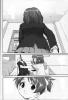 Original 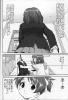 This post has been edited by Super Shanko: Oct 18 2010, 11:16 This post has been edited by Super Shanko: Oct 18 2010, 11:16 |
|
|
|
|
|
|
Oct 18 2010, 11:42
|
rookie84
Group: Gold Star Club
Posts: 828
Joined: 23-June 08
|
AdvancedOkay, so we've gone over cleaning, and we've gone over typesetting. These two steps are pretty easy to pick up, and once you know how to do them you can edit most of almost any doujinshi. However, there is one more stage to editing, and this is the most difficult of all: editing text on a background. This is difficult even for experienced editors, and it can be extremely time-consuming. Don't listen to anyone who says this is easy; either they're insanely good, or they're lying out of their asses. Anyway, let's go over some of the techniques you can use for typesetting over backgrounds. I'm going to use the image Super Shanko posted (hope you don't mind), since it has good examples for everything I'm going to talk about. (IMG:[ sadpanda.us] http://sadpanda.us/images/265626-TILVPDQ.jpg) First, let's clean the sucker. This is a high-quality image that doesn't need rotating, cropping, or resizing, so all we'll do to it is level. I pick the sock in the middle panel as the black point, and inside the center margins for the white point, to get this: (IMG:[ sadpanda.us] http://sadpanda.us/images/265627-BKLF8GM.jpg) On the left margin, you can see the shadow where the page was bent. Since it's all supposed to be white space, we can simply erase the shadow to get this: (IMG:[ sadpanda.us] http://sadpanda.us/images/265628-GK9Q9EN.jpg) Now the page is ready for editing. Stroking TextBefore we get to how to remove the Japanese text, let's talk about typesetting on a background. It's fairly simple to use black text on a white background and white text on a black ground, but when the background is different shades or very complicated, the text can be hard to see. An easy way to eliminate this problem is to stroke the text, which means to place a line of color around the text. Anyway, the translation for the text in the image is below: CODE That older sister seems to have been tempted by sweets
To join the light music club.
When she's having fun playing around with the guitar,
She looks like a kid who's been given a toy.
Aah...
Everyone in the club, you've drawn in a person who's a lot of trouble... I like using Wild Words Italic for thoughts and exposition, so I'll just use that to set the type, adjusting the size as necessary. Since the large text in the top panel is in white, I'll change the color of the corresponding translation to white too to match them. (IMG:[ sadpanda.us] http://sadpanda.us/images/265631-G78OK9R.jpg) Now, let's stroke the text. I'm aware that in Photoshop, the text effects let you do this fairly easily, and I have no idea what it's like in Paint.net, but in GIMP, it's a little different. Disregard the steps below if you don't use GIMP. 1) Duplicate the text layer (right-click on a layer in the layers dialog box) 2) Turn the bottom text layer into a path (same again, but choose Text to Path) (IMG:[ sadpanda.us] http://sadpanda.us/images/265633-402B59D.jpg) 3) Stroke path (Edit > Stroke Path) (IMG:[ sadpanda.us] http://sadpanda.us/images/265635-SEGMLJ1.jpg) Choose your preferences, and then stroke the text. I decide to use a black stroke of 5 pixels for the large white text and a white stroke of 3 pixels for the smaller black text, and I get this: (IMG:[ sadpanda.us] http://sadpanda.us/images/265637-0X79ZIZ.jpg) You can set the stroke to as thick or thin as you want. IMO, thinner strokes look better, but thicker strokes help you hide any damage you may make to the background when trying to edit out Japanese text. That's it for stroking text, let's move on to the next step. CloningMake all of the text layers invisible by clicking on their eye symbols to return to this: (IMG:[ sadpanda.us] http://sadpanda.us/images/265628-GK9Q9EN.jpg) The most important tool in editing text on a background is the Clone Stamp (button with a stamp in the Toolbox). (IMG:[ sadpanda.us] http://sadpanda.us/images/265641-YVQM04L.jpg) Basically, what this tool does is copy from one part of the image and paste it onto another part. If you choose parts of the image that are similar, you can effectively "hide" the Japanese text and make it look like nothing was there. How well a job you do depends a lot on how complicated the background is and how careful you are. A couple of points: 1) Do any cloning at an increased magnification. 200% may be sufficient if the image is very big, but I usually use 400%. 2) Just like erasing, you can choose the size of the brush and what kind of brush you use. I tend to use a large soft brush for gradients and a small hard brush for lines. Anyway, I work some cloning magic, and in the end I get this: (IMG:[ sadpanda.us] http://sadpanda.us/images/265643-5QUDS0V.jpg) It's not perfect, and there are a few mistakes, particularly around the bed, but hopefully the text will hide that. Of course, if it still bothers you, here is the final tool in your arsenal: RedrawingFor redrawing, basically you take advantage of the Paths tool. (Weird button next to the eyedropper in the Toolbox). (IMG:[ sadpanda.us] http://sadpanda.us/images/265645-S1FPURG.jpg) This tool lets you draw lines by clicking two separate points, and then curving the line by dragging your mouse along different points of the line. I draw a path with three points following the curve of the pillow. Like cloning, I do this at increased magnification. (IMG:[ sadpanda.us] http://sadpanda.us/images/265650-J4VQRAV.jpg) I then stroke it. I have to do a couple of trial and errors, undoing each time I don't like it, but eventually I decide to stroke it at 2 pixels to get this: (IMG:[ sadpanda.us] http://sadpanda.us/images/265652-9W9KO8H.jpg) I do the same for the bottom of the pillow, and the image ends up as this: (IMG:[ sadpanda.us] http://sadpanda.us/images/265653-KO3V752.jpg) Finally, I make all the text layers visible again. I move up the text around the pillow to cover it up, and I end up with this: (IMG:[ sadpanda.us] http://sadpanda.us/images/265654-F8XBRX4.jpg) This should be enough for you to edit practically any doujinshi no matter what the situation. If anyone else has anything to add, go ahead, because that's the extent of my editing know-how. This post has been edited by rookie84: Nov 1 2010, 23:16
|
|
|
|
|
|
|
1 User(s) are reading this topic (1 Guests and 0 Anonymous Users)
0 Members:
|
 |
|
 |
|
|
|


