 |
 |
 |
 Jespassinthrough Does The Lewd Art and Stuff Jespassinthrough Does The Lewd Art and Stuff, Help me improve by shouting at me! |
|
 Sep 17 2017, 09:39
|
Lullala
Newcomer
 Group: Recruits
Posts: 16
Joined: 20-June 17

|
Damn, I must say I love your art work. Not to mention you learned it yourself, it really looks great!
|
|
|
|
 Sep 17 2017, 23:01
|
jespassinthrough
Newcomer
  Group: Members
Posts: 95
Joined: 8-July 17

|
QUOTE(Lullala @ Sep 17 2017, 01:39) 
Damn, I must say I love your art work. Not to mention you learned it yourself, it really looks great!
Aw geez, you're making me blush. (IMG:[ invalid] style_emoticons/default/blush.gif) |
|
|
|
 Sep 17 2017, 23:04
|
ThunderKurono
Group: Members
Posts: 379
Joined: 3-August 12

|
To be honest I like your art-style.
Do you have tumblr, buddy?
|
|
|
|
|
 |
|
 Sep 17 2017, 23:20
|
jespassinthrough
Newcomer
  Group: Members
Posts: 95
Joined: 8-July 17

|
In collaboration with [ seishihentai.tumblr.com] Seishihentai (hwriter), I've been tasked with creating a single page comic featuring Christy Marks as Nancy Monet in "Youthful Innocence". The first page was a pin-up posted a month ago. Between then and now I've been practicing hard and I think the results show pretty clearly. So I present to you my first ever fully completed hentai page! 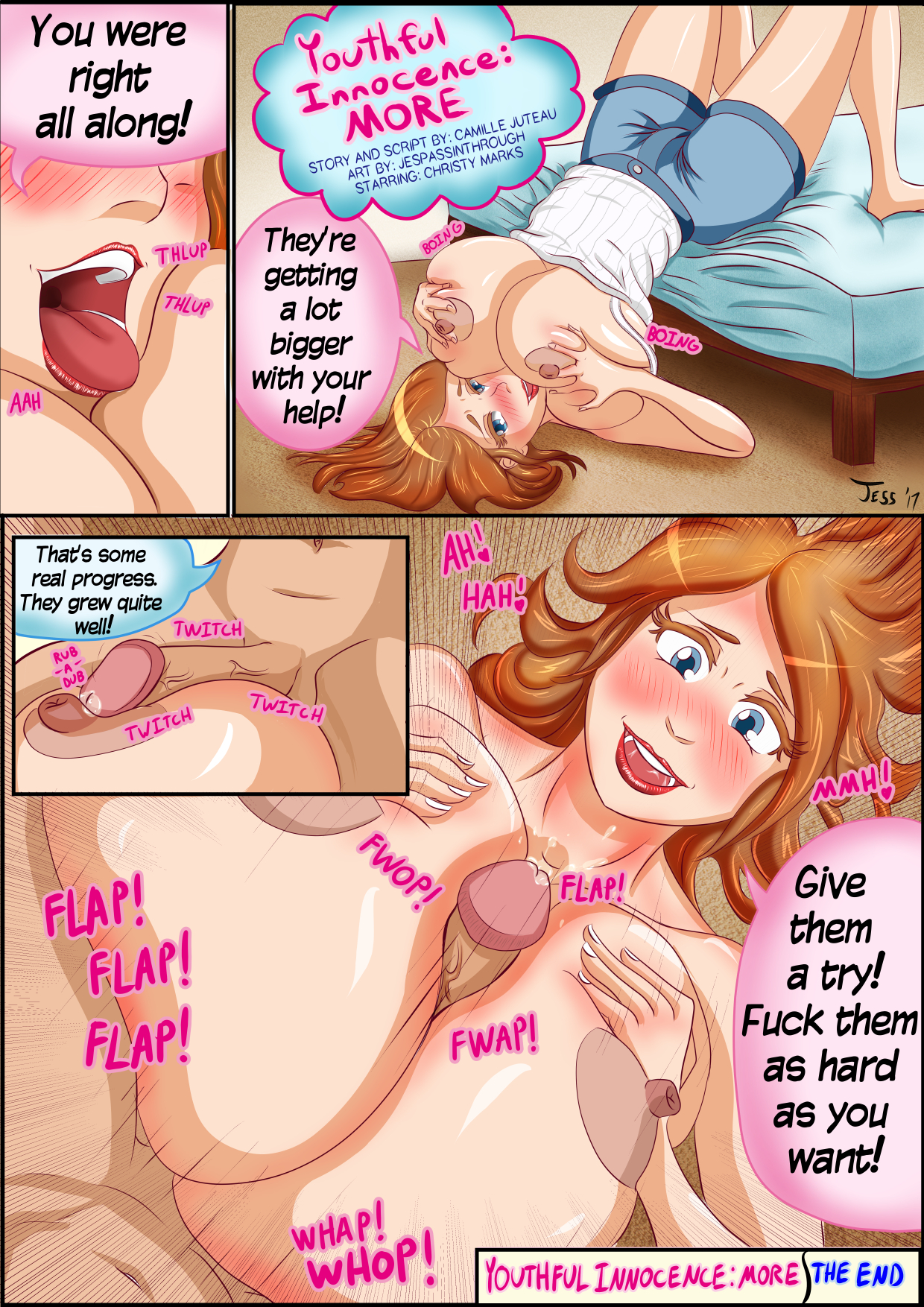 Oh, and I did a bonus page for funzies! 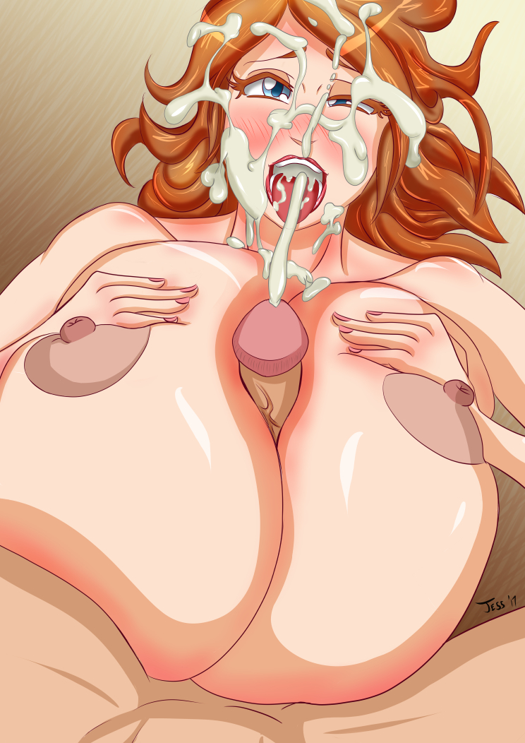 This was a big milestone for me. Aside from those sketched out pages I posted a while back, this is the only time I've ever included panels in my work. I've almost exclusively been a pin-up artist but it feels good to branch out a bit. Personally I'm hoping to do some of my own full comics in the future, but that's a long ways off. A single page like this takes a long time. At my current rate a full hentai of about 12-15 pages would take close to a full month to produce. My goal on that is to get it down to about 2 weeks. In the meantime, back to the grind. Currently working on several concurrent pin-ups because that's just how I do things. No clue which one will end up finished though. Expect something in the next few days. Hopefully. Not gonna lie, my schedule turns on a dime and I don't know which direction it will go when it does. Questions? Comments? Insensitive remarks about my mother? I'm desperate enough for human contact to listen to you! |
|
|
|
|
 |
|
 Sep 17 2017, 23:21
|
jespassinthrough
Newcomer
  Group: Members
Posts: 95
Joined: 8-July 17

|
QUOTE(ThunderKurono @ Sep 17 2017, 15:04) 
To be honest I like your art-style.
Do you have tumblr, buddy?
[ jespassinthrough.tumblr.com] SHABAM!My tumblr is pretty bare, and if you follow me here, you've already seen everything on my tumblr. But hey, feel free to like, reblog, comment, whatever! Every little bit helps! |
|
|
|
|
 |
|
 Sep 19 2017, 07:45
|
jespassinthrough
Newcomer
  Group: Members
Posts: 95
Joined: 8-July 17

|
I got it into my head that I should start and finish a piece within a single day. I also got it into my head that I should experiment with different outlines and a more painterly style. The result is regretful but also a benchmark of how far I've come in the past couple of months. I guess it's for that latter reason alone I'm making this thing public because if I had spent more than a day on this I'd probably have scrapped it or let it languish in my "WIP" folder with the rest of the pieces I can't properly finish. I mean look at that background!
I PUT HOURS OF EFFORT INTO IT AND IT'S FUCKING AWFUL AND BLAND AND SLOPPY AS HELL BECAUSE THAT'S ACTUALLY THE BEST I COULD DO!Hooooly fuck, I need to practice my backgrounds because this shit is unacceptable. I should also stop making them afterthoughts and actually have a solid idea of the setting before I put stylus to tablet. That would help... Anyways there's a bunch of other things I'd rant about in this, but for the sake of my curiosity and getting others involved in my work, I'm just going to hold on to my extensive list of self-criticisms and see how many of them line up with what you see. 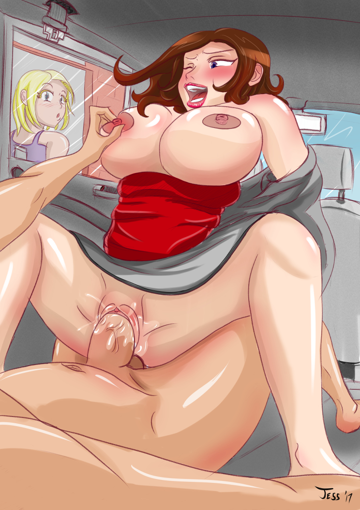 Fun Fact: This is actually Infectonator 2 fan art. I recently rediscovered that old flash game from 2012 and the GLORIOUSLY busty Toge News Anchor after finding out there was a mobile port of it. |
|
|
|
|
 |
|
 Oct 11 2017, 19:49
|
jespassinthrough
Newcomer
  Group: Members
Posts: 95
Joined: 8-July 17

|
Pretty recently I've been asked to work on a collab project. While the specifics of it are being ironed out, I've taken it upon myself to practice some elements that I'll be drawing later. This sketch got way out of hand and I ended up setting it up to be a series of 6 pics. This is the most complicated version of this picture set. I'll be posting the whole set by Saturday, hopefully. Each picture will follow roughly the same layout, girl in the middle spread wide open and getting fucked silly by a tentacle. Normally my view of these sorts of picture sets is to say, "how lazy, yet efficient, of them". And I still hold that view to a degree. It's certainly made me appreciate just how difficult it is to organize and clean up a piece to be the base for 5 other pieces, and I recognize that sometimes people just want a different version of the same picture (i.e. pic with cum vs pic without cum, pic with one facial expression vs pic with other facial expression). However, this isn't a process I enjoy using and I personally prefer my works to be very distinct from each other. Usually to hide the fact that I am very inconsistent. Wow, I sound really insecure right now. Anyways, enough about me. Let's talk about the picture. What I want to know is this: How squishy does the background look? Do you know any way to make it look squishier? Do you know anything about making translucent tentacles? I've been messing with a bunch of techniques but none of them really work so I just made this tentacle opaque. Also, how do you like the watermark? Too much? Bad placement? I never usually watermark my stuff aside from putting my name and date on it so I want to know if it's distracting rather than eye-catching. 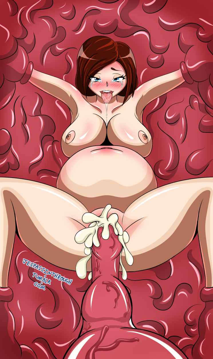 Personally I'm thinking of darkening the background in places, changing the transparency of some of the highlights, and giving things a bit more of a red tinge to reflect the background. btw: Anyone know of any references for large breasts in zero-gravity? Since no one's made space porno yet, and I'm neither rich nor an astronaut, I'm just going to make some myself. This post has been edited by jespassinthrough: Oct 11 2017, 20:24 |
|
|
|
|
 |
|
 Oct 14 2017, 19:53
|
jespassinthrough
Newcomer
  Group: Members
Posts: 95
Joined: 8-July 17

|
Nearly true to my word, 5 pictures in a set, on Saturday. I know I'm missing one, and the cut picture was the one post-inflation but pre-tentacle ejaculation. Honestly it just felt unnecessary to show the effects of tentacle jizz without the splooge effect and additionally it gave the impression of impregnation rather than cumflation. I mean from a certain point of view this is still the case, but less so with the splooge. Also I made a non-inflation version for people not into distended bellies. As for the picture set itself, it actually took longer than expected because I ended up working... backwards. Due to a, frankly, shocking lack of organization and foresight I didn't set up the original ink work and colors correctly so I had to go back and do a lot of clean-up work and adjustments and... to keep it short, it was a mess. But I learned some new tricks and I can use them in the future. Though not too often, I'm still not partial to making picture sets unless I really have to.      Not going to lie, it's going to be a long time until my next (complete) piece is done. This project is going to be the biggest one I've ever worked on and I'm putting in my best efforts to make it look amazing. In the meantime, uh... just... keep doing what you're doing? |
|
|
|
|
 |
|
 Oct 14 2017, 23:12
|
Slobber
Group: Gold Star Club
Posts: 7,794
Joined: 4-February 11

|
Which artists have given you inspiration? Your style reminds me of Melkor Mancin's. Maybe worth giving a look if you haven't already if you're an advocate of continuous improvement.
|
|
|
|
|
 |
|
 Oct 15 2017, 01:41
|
jespassinthrough
Newcomer
  Group: Members
Posts: 95
Joined: 8-July 17

|
"If you're an advocate of continuous improvement", he says. The subtitle of this entire thread is "Help me improve by shouting at me!" Of course I'm an advocate! (IMG:[ invalid] style_emoticons/default/laugh.gif) And it's funny you should mention Melkor, because I took a look at his works and found out that I'd been using some as references without knowing. In my travels across the fetishsphere I've only found a few isolated pages of his work, none of which had his name on it. Now that I know who he is, he's certainly earned a place in my "Inspired by" list. That list, by the way, goes, in no particular order: - Melkor Mancin
- Kusanagi Tonbo
- Wanaca (Sakura Series game char designer)
- Sinner
- Gerph
- DarkArtsKai
- Amakuchi
- Slugbox
- MikeyMegaMega
- Most hentai OVAs because almost all their shading styles are fairly similar
Those are just the ones off the top of my head, there's way more artists out there I regularly use bits and pieces from to modify for my own uses. Though I will say that Winged Cloud and the Shantae series is what set me down the path of flat coloring with airbrushing around highlights, which I consider an integral part of my style. As for the ones who don't fit into that sort of aesthetic, I take inspiration from other things like character design, backgrounds, anatomy, and subject matter. By the way, thanks! It's kinda flattering to be compared to an already established artist. I know there's more work to be done until I can compete rather than compare, but hey, every bit counts. This post has been edited by jespassinthrough: Oct 15 2017, 01:42 |
|
|
|
|
 |
|
|
 |
|
 Oct 16 2017, 02:44
|
jespassinthrough
Newcomer
  Group: Members
Posts: 95
Joined: 8-July 17

|
Ah sweet! More reference material and a good thread! And it's so fucking COLORFUL! Thanks for sharing this with me! This should help me out quite a bit when I have a chance to get back to colored works. Unfortunately though the fourth link you gave me doesn't work. Just says the gallery has been removed.
|
|
|
|
 Oct 16 2017, 03:03
|
Slobber
Group: Gold Star Club
Posts: 7,794
Joined: 4-February 11

|
Which one? Try using the black site. The balanced anatomy I was referring to
(C87) [NANIMOSHINAI (Sasamori Tomoe)] Succubus Stayed Life [English] [Facedesk] pg22 (the concept design by the artist)
Texturing/perspective/poses/proportioning I linked (C83) [Circle Ohigetan (Ohigetan)] Ohigebon-38 Boku no Kanojo. [English] [Striborg]
|
|
|
|
|
 |
|
 Oct 16 2017, 16:58
|
jespassinthrough
Newcomer
  Group: Members
Posts: 95
Joined: 8-July 17

|
The link that was broken was the one to the balanced anatomy references you were talking about. A quick google search of the title and author brought me to a site called nhentai.net, which had a black background, but I don't think that's what you meant by "using the black site". Which leaves the question, what IS this black site you're talking about? The link you gave me for the texturing, perspectives, etc did work though and I'll be studying a bit more from both artists in the future. Thanks again for the info!
|
|
|
|
|
 |
|
 Nov 27 2017, 06:05
|
jespassinthrough
Newcomer
  Group: Members
Posts: 95
Joined: 8-July 17

|
Hey! Hi! Been a while! Uh... real quick, this isn't the thing I've been working on for the past month and a half, this is something that momentarily distracted me from that thing I should be working on. I didn't spend too long on this, a few hours at most so it's pretty rough. But I figured I'd share it on the off-chance I can't scrape together some time to ink and refine it between keeping my life together and working on that other big project. So uh, hope you all had a good Thanksgiving or weekend or what have you and wish you luck in the coming holiday, Christmas, New Years, season! I'm just gonna... gonna get back to work. Keep an eye out for a refined version of this and more in the future. Hopefully before the year is done, but that's doubtful. It's important I keep putting stuff out there on a consistent schedule. Shame my life is anything but consistent. 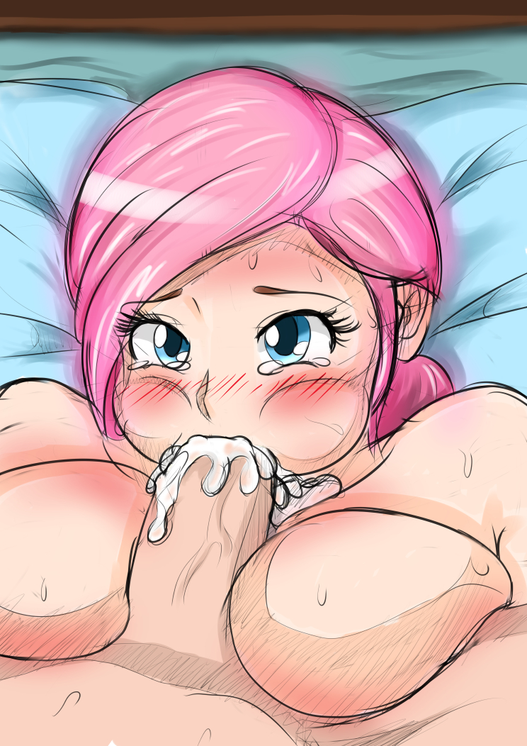 "... someone needs to get her a napkin... poor thing." - Friend o' mine, while critiquing this piece "... someone needs to get her a napkin... poor thing." - Friend o' mine, while critiquing this piece |
|
|
|
|
 |
|
 Dec 5 2017, 08:40
|
jespassinthrough
Newcomer
  Group: Members
Posts: 95
Joined: 8-July 17

|
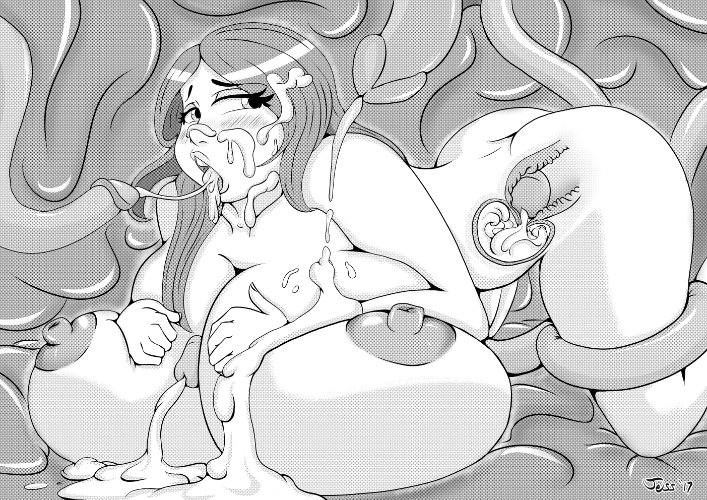 So, while working on that project I keep mentioning, I realized that I don't like doing flat shading for grayscale works, so I taught myself how to use screentones. I've only ever used screentones once before and it was a complete shit-show. Since I had the sketch for this one sitting around for about a month, and it features all the same things that the project features, I figured I'd use this sketch as practice and as a signal that I'm not dead yet. I think it worked out pretty well. Looks different from my working copy, it's much lighter, but that's image compression for ya. I'll be sure to compensate next time. If you're interested in how I made this one, let me know, otherwise I'm just going to save myself the time and effort of writing up a detailed list of my methods. This offer stands for the rest of time and for all of my work, by the way. Just say the word and I'll spill some beans. In the future I may come back to this one and make alternate versions, for practice and for fun. Gotta know how to edit my existing work, just in case. |
|
|
|
|
 |
|
 Dec 12 2017, 09:46
|
VanillaThunder89
Newcomer
  Group: Members
Posts: 51
Joined: 24-August 16

|
QUOTE(jespassinthrough @ Dec 5 2017, 01:40) 
So, while working on that project I keep mentioning, I realized that I don't like doing flat shading for grayscale works, so I taught myself how to use screentones.
Question. Why? As a someone who primarily just colors stuff, I loathe the screentones. They are such a pain in the ass to work around. This post has been edited by VanillaThunder89: Dec 12 2017, 09:46 |
|
|
|
|
 |
|
 Dec 19 2017, 02:50
|
jespassinthrough
Newcomer
  Group: Members
Posts: 95
Joined: 8-July 17

|
Well, the best answer I can give is also the least satisfying: I use screentones because I want to. There's any number of reasons why one would use screentones, such as saving ink for printing, adding visual interest through texturing, or because they're familiar with it. Me? I just wanted to give it a shot and I liked the result. And as I'm finding out through using it more often, it also gives me more leeway in how I shade things. My strokes don't have to be as precise as if I were using flat color, so it's faster, easier, and somewhat cleaner.
Though I guess now I can consider using screentones as a minor deterrent to anyone wanting to do unauthorized renditions of my work, if it's really that much of a pain to work around.
|
|
|
|
|
 |
|
 Jan 10 2018, 03:58
|
jespassinthrough
Newcomer
  Group: Members
Posts: 95
Joined: 8-July 17

|
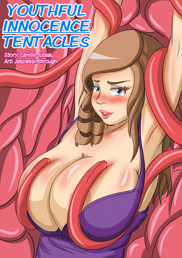 Guess who finished their 3 month long project? This fucker did. And this fucker also put it in a gallery for your viewing pleasure. Now that I'm done with this beast of an accomplishment, I can get to work on finishing more pieces on a shorter timescale! |
|
|
|
 Feb 14 2018, 17:16
|
jespassinthrough
Newcomer
  Group: Members
Posts: 95
Joined: 8-July 17

|
Happy Valentine’s Day! Sorry this isn’t Valentine’s themed, but this is all I could finish in the time I have nowadays. I’m still working on another comic, but there’s been a few more hang-ups on it than I expected so I can’t say how long it’ll be until it’s done. In the mean time I’m considering posting sketches more often instead of just fully finished pieces. Y’know, just to keep myself visible while I work on other things. Anyways, enjoy the holiday! 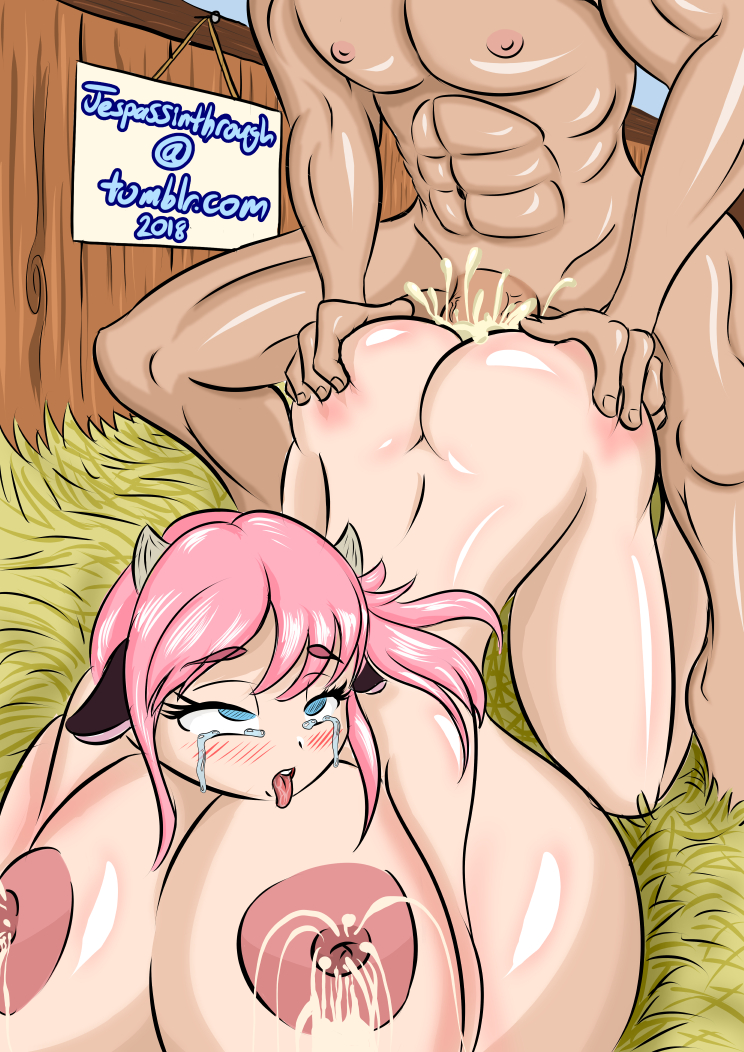
|
|
|
|
1 User(s) are reading this topic (1 Guests and 0 Anonymous Users)
0 Members:
|
 |
 |
 |
|