Welcome Guest ( Log In | Register )

2 Pages V  1 2 >  
Reply to this topicStart new topic
> Your custom font, What custom font do you use?

 
post Jan 9 2016, 23:46
Post #1
Puiu


Newcomer
*
Group: Members
Posts: 24
Joined: 8-April 08
Level 202 (Destined)


Hey guys,
I've recently experimented with custom fonts and i decided to use the following:
font-family: Roboto (it's the font that is generally used by google in android)
font-size: 11
font-weight: normal
font-style: normal
vertical adjust: -5

It looks fairly clean and easy to read; the speed is also good.
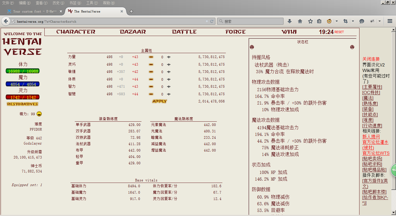
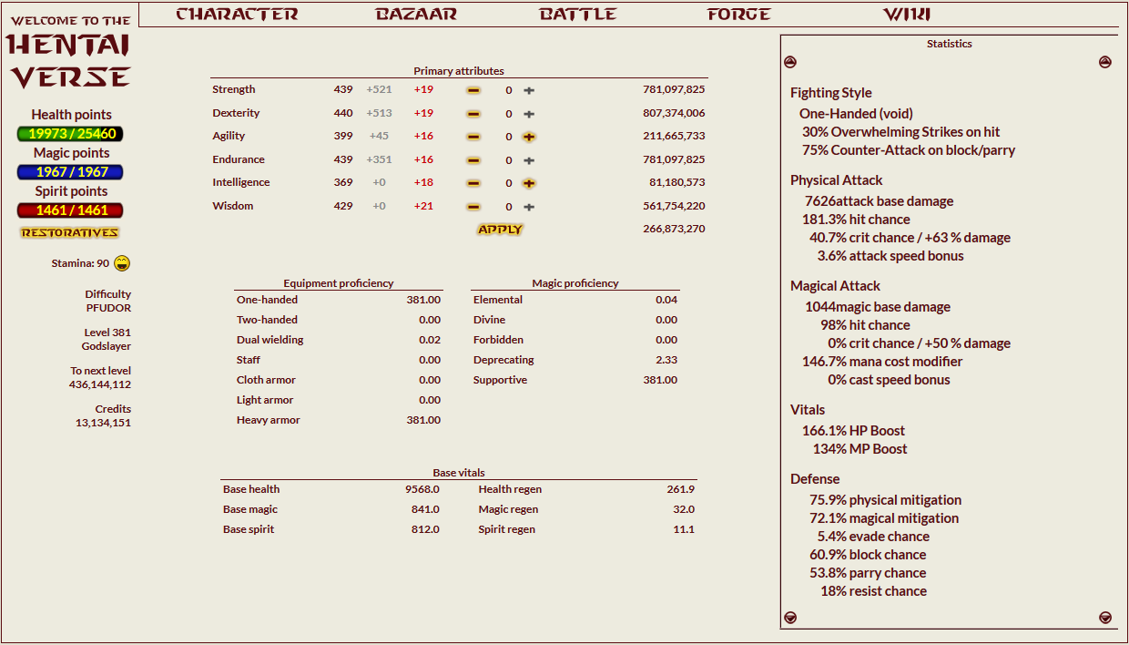
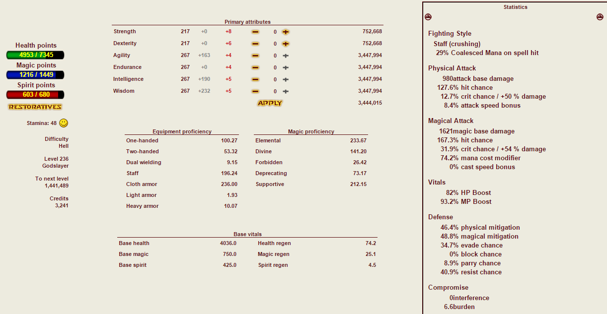
here's how it looks: [gyazo.com] picture

What are you guys using?

PS: does anyone know if the visual bugs will get fixed? (the missing space after the numbers in the statistics and the numbers going back to the default font when changing your primary stats)
User is offlineProfile CardPM
Go to the top of the page
+Quote Post

 
post Jan 9 2016, 23:49
Post #2
chjj30


🦘跳海魔女🧙王世坚🌊
***********
Group: Catgirl Camarilla
Posts: 10,570
Joined: 5-January 14
Level 500 (Ponyslayer)


font-family 宋体
font-size 10
font-weight normal
font-style (blank)
vertical adjust -2
User is offlineProfile CardPM
Go to the top of the page
+Quote Post

 
post Jan 10 2016, 00:36
Post #3
Puiu


Newcomer
*
Group: Members
Posts: 24
Joined: 8-April 08
Level 202 (Destined)


QUOTE(chjj30 @ Jan 9 2016, 23:49) *

font-family 宋体
font-size 10
font-weight normal
font-style (blank)
vertical adjust -2

I have that font but i never checked how the letters looked because of the kanji (IMG:[invalid] style_emoticons/default/biggrin.gif)
Now i'm checking all of these type of fonts in photoshop just to see how they look.
User is offlineProfile CardPM
Go to the top of the page
+Quote Post

 
post Jan 10 2016, 01:13
Post #4
chjj30


🦘跳海魔女🧙王世坚🌊
***********
Group: Catgirl Camarilla
Posts: 10,570
Joined: 5-January 14
Level 500 (Ponyslayer)


QUOTE(Puiu @ Jan 10 2016, 06:36) *

I have that font but i never checked how the letters looked because of the kanji (IMG:[invalid] style_emoticons/default/biggrin.gif)
Now i'm checking all of these type of fonts in photoshop just to see how they look.


Attached Image

Like this. Because I use the Translate Scrpt, so I need the font with kanji.

This post has been edited by chjj30: Jan 10 2016, 01:13
User is offlineProfile CardPM
Go to the top of the page
+Quote Post

 
post Jan 10 2016, 01:22
Post #5
Sapo84


Deus lo vult
********
Group: Gold Star Club
Posts: 3,331
Joined: 14-June 09
Level 500 (Ponyslayer)


font-family: Lato (fansub ruined my tastes in fonts (IMG:[invalid] style_emoticons/default/dry.gif))
font-size: 9
font-weight: bold
font-style: normal
vertical adjust: -4

Attached Image
User is offlineProfile CardPM
Go to the top of the page
+Quote Post

 
post Jan 10 2016, 02:00
Post #6
Kuoo


I'm retired ᕙ(•̀‸•́‶)ᕗ
************
Group: Gold Star Club
Posts: 27,979
Joined: 13-June 13
Level 500 (Godslayer)


font-family: Cambria
font-size: 11
font-weight: bolder
font-style: italic
vertical adjust: -5

Attached Image
User is offlineProfile CardPM
Go to the top of the page
+Quote Post

 
post Jan 10 2016, 02:01
Post #7
FabulousCupcake


Casual Poster
****
Group: Gold Star Club
Posts: 478
Joined: 15-April 14
Level 442 (Dovahkiin)


Noto Serif @ 10px with -6px vertical adjustment.
Everything looks really weird with sans serif fonts.
(IMG:[my.mixtape.moe] https://my.mixtape.moe/hoqocn.png)

This post has been edited by FabulousCupcake: Jan 10 2016, 02:16
User is offlineProfile CardPM
Go to the top of the page
+Quote Post

 
post Jan 10 2016, 02:21
Post #8
Vastasto


Casual Poster
***
Group: Members
Posts: 110
Joined: 17-February 11
Level 292 (Godslayer)


font-family: System
font-size: 5
font-weight: normal
font-style: normal
vertical adjust: 0
User is offlineProfile CardPM
Go to the top of the page
+Quote Post

 
post Jan 10 2016, 03:22
Post #9
Puiu


Newcomer
*
Group: Members
Posts: 24
Joined: 8-April 08
Level 202 (Destined)


after seeing a few of your font settings i changed the size from 11 to 10. that also fixed the left side, it was overlapping some of the characters.

for now i'll stick with Roboto/10/normal/-5

(IMG:[i.gyazo.com] https://i.gyazo.com/d1a41c581029259eebddb1db44edde1a.png)

This post has been edited by Puiu: Jan 10 2016, 03:24
User is offlineProfile CardPM
Go to the top of the page
+Quote Post

 
post Jan 10 2016, 03:41
Post #10
aiwotorimodose


(」・ω・)」うー! (/・ω・)/にゃー!
*********
Group: Members
Posts: 7,011
Joined: 23-December 11
Level 419 (Godslayer)


font-family: verdana
font-size: 8
font-weight: normal
font-style:
vertical adjust: 0

plainly boring, kinda fit when you do nothing but few RE rounds
User is offlineProfile CardPM
Go to the top of the page
+Quote Post

 
post Jan 10 2016, 13:55
Post #11
EsotericSatire


Look, Fat.
***********
Group: Catgirl Camarilla
Posts: 11,316
Joined: 31-July 10
Level 500 (Ponyslayer)


Veranda; one of the fastest fonts.
User is online!Profile CardPM
Go to the top of the page
+Quote Post

 
post Jan 10 2016, 20:00
Post #12
suzuyuki.xisatu


Lurker
Group: Lurkers
Posts: 1
Joined: 29-October 15
Level 136 (Ascended)


font-family: Palatino
font-size: 12
font-weight: normal
font-style: normal
vertical adjust: -6

Palatino because i like this font in fantasy books.
User is offlineProfile CardPM
Go to the top of the page
+Quote Post

 
post Jan 10 2016, 21:50
Post #13
cmos


神がかりの宝探し屋
*******
Group: Gold Star Club
Posts: 1,214
Joined: 17-March 10
Level 500 (Godslayer)


Tahoma
10
normal
normal
-4
User is offlineProfile CardPM
Go to the top of the page
+Quote Post

 
post Jan 12 2016, 20:41
Post #14
Pillowgirl


Grammatically Incorrect (☞゚∀゚)☞
*********
Group: Gold Star Club
Posts: 5,147
Joined: 2-December 12
Level 479 (Godslayer)


QUOTE(EsotericSatire @ Jan 10 2016, 21:55) *

Veranda; one of the fastest fonts.

Verdana or Veranda lol?


If you want to cut down on rendering you use a basic font from 30 years ago, those are the fastest ones.


I use;

font-family: fixedsys
font-size: 9
font-weight: bolder
font-style:
vertical adjust: -2


(IMG:[upload.wikimedia.org] https://upload.wikimedia.org/wikipedia/commons/thumb/e/e6/Fixedsysfontpreview.svg/203px-Fixedsysfontpreview.svg.png)
(IMG:[upload.wikimedia.org] https://upload.wikimedia.org/wikipedia/commons/2/23/Fixedsys_Basic.png)
User is offlineProfile CardPM
Go to the top of the page
+Quote Post

 
post Jan 13 2016, 11:36
Post #15
Void Domain


Active Poster
*******
Group: Catgirl Camarilla
Posts: 2,131
Joined: 30-May 10
Level 500 (Godslayer)


QUOTE(Pillowgirl @ Jan 13 2016, 02:41) *

Verdana or Veranda lol?
If you want to cut down on rendering you use a basic font from 30 years ago, those are the fastest ones.
I use;

font-family: fixedsys
font-size: 9
font-weight: bolder
font-style:
vertical adjust: -2

Was using arial, because it starts with A and its the only one I know?
I like this font. Will be using it for a while (IMG:[invalid] style_emoticons/default/laugh.gif)
User is offlineProfile CardPM
Go to the top of the page
+Quote Post

 
post Jan 13 2016, 12:34
Post #16
Dead-ed


Niten = 我が両刀に断てぬもの無し。
********
Group: Members
Posts: 3,564
Joined: 4-March 14
Level 500 (Godslayer)


Arial for efficiency.
Wanna try wingdings if i get bored.
User is offlineProfile CardPM
Go to the top of the page
+Quote Post

 
post Jan 13 2016, 18:36
Post #17
nobody_xxx


((´☻ω☻`) $◞౪◟$ (´☻ω☻`))
***********
Group: Gold Star Club
Posts: 13,753
Joined: 7-December 10
Level 496 (Godslayer)


using veranda here (IMG:[invalid] style_emoticons/default/happy.gif)
User is offlineProfile CardPM
Go to the top of the page
+Quote Post

 
post Jan 17 2016, 19:38
Post #18
cheg0


Newcomer
**
Group: Members
Posts: 80
Joined: 21-February 14
Level 283 (Godslayer)


font-family: default
font-size: 8
font-weight: bold
font-style: normal
vertical adjust: -2

Attached Image

This post has been edited by cheg0: Jan 17 2016, 19:53
User is offlineProfile CardPM
Go to the top of the page
+Quote Post

 
post Jan 19 2016, 04:04
Post #19
bentonville


Lurker
Group: Lurkers
Posts: 2
Joined: 15-January 16
Level 68 (Master)


I'm boring. I went with:

"Trebuchet MS"
Size 9
Normal
-3 vertical adjust.

But it works for me.
User is offlineProfile CardPM
Go to the top of the page
+Quote Post

 
post Jan 22 2016, 14:03
Post #20
cichy133


へんたいロリコン
*****
Group: Members
Posts: 514
Joined: 20-July 10
Level 475 (Dovahkiin)


QUOTE(Pillowgirl @ Jan 12 2016, 19:41) *

Verdana or Veranda lol?
If you want to cut down on rendering you use a basic font from 30 years ago, those are the fastest ones.
I use;

font-family: fixedsys
font-size: 9
font-weight: bolder
font-style:
vertical adjust: -2
(IMG:[upload.wikimedia.org] https://upload.wikimedia.org/wikipedia/commons/thumb/e/e6/Fixedsysfontpreview.svg/203px-Fixedsysfontpreview.svg.png)
(IMG:[upload.wikimedia.org] https://upload.wikimedia.org/wikipedia/commons/2/23/Fixedsys_Basic.png)


Oh Jesus them Commodore 64 flashbacks (IMG:[invalid] style_emoticons/default/biggrin.gif)
User is offlineProfile CardPM
Go to the top of the page
+Quote Post


2 Pages V  1 2 >
Reply to this topicStart new topic
1 User(s) are reading this topic (1 Guests and 0 Anonymous Users)
0 Members:


Lo-Fi Version Time is now: 6th May 2024 - 08:30