Loading. Please Wait... 
 |
 |
 |
 [Red's] EHCOVE & YQII bounties [Red's] EHCOVE & YQII bounties, primarily for discussion of editing bounties, but TL stuff too |
|
 Jul 7 2014, 19:01
|
Alex68785
Group: Members
Posts: 342
Joined: 4-May 08

|
I made my first ever attempt at typesetting something. Vertical bubbles are probably not the best idea to work on as a first ever project in retrospect. So I hope it isn't terrible. I used the script linked in the bounty as a test but it seems... rough? It's also missing bubbles. I just did the first page to see if you even liked it. The bubbles left blank have nothing in the script, I matched the text before placing the bubbles I did do. Many pages have missing bubbles too. Please let me know your thoughts, or if you want a different font, etc. [ postimg.org] http://postimg.org/image/59kpxm0vb/ |
|
|
|
|
 |
|
|
|
|
Jul 8 2014, 03:12
|
Super Shanko
Group: Members
Posts: 5,647
Joined: 29-June 08
|
QUOTE(Alex68785 @ Jul 7 2014, 10:01)  I made my first ever attempt at typesetting something. Vertical bubbles are probably not the best idea to work on as a first ever project in retrospect. So I hope it isn't terrible. I used the script linked in the bounty as a test but it seems... rough? It's also missing bubbles. I just did the first page to see if you even liked it. The bubbles left blank have nothing in the script, I matched the text before placing the bubbles I did do. Many pages have missing bubbles too. Please let me know your thoughts, or if you want a different font, etc. [ postimg.org] http://postimg.org/image/59kpxm0vb/Son, take my hand: -Focus on centering the text. If you're using Photoshop, use the arrow keys to manually nudge and align the text. I don't know if GIMP has that feature. -Don't line break words if they're all under one text tool box thingy. -I'm not a translator, but I think that line "Anyway" is meant for the second bubble attached to it, sounding like "There were lots of customers," // "Anyway..." The same for "Can't be helped," // "Here." and so on. -Change the mode to greyscale. I blame the scanner for this, but it probably shouldn't have that color tint like that. -There's nothing wrong with putting question marks, or ellipsis marks on the bottom of lines if it's for better alignment. These have been helpful tips from your friendly neighborhood Editor. This post has been edited by Super Shanko: Jul 8 2014, 04:50 |
|
|
|
|
|
|
Jul 8 2014, 07:12
|
Alex68785
Group: Members
Posts: 342
Joined: 4-May 08
|
Thanks for the tips. This is the raw https://e-hentai.org/s/7548358bee/680515-3 for reference. I'm finding it's utter hell to center text in vertical oval shaped bubbles. Also I'm using photoshop and I don't know if it's the copy of wild words I downloaded or what but it seems to put a good amount of space in random parts. First panel second bubble is "lots of customers" but for some reason it makes it look like I put a break there. I tried to avoid hyphenated words so I already put the ellipsis on the bottom. I was actually worried if that was acceptable or not. Looking back the "why are you here?" and "Oh, right" needs to be moved a little. Again vertical oval bubbles are proving to be a bitch. From looking at the raw and the available translation the lines" なんでお前hあココにいるんだ? why are you here?" and "いーだろ お隣さんだから it's fine. we're neighbors anyway"match to those bubbles. I don't speak japanese at all myself. so I just looked and matched. I'm grateful to YQII for actually including the kanji to do this. I did this as a second try with making multiple text spaces trying to keep them center to avoid that gap in the customers and anyway. Also made it gray. [ postimg.org] http://postimg.org/image/hue6tsjl7/full/Open to any other suggestions. a couple things I noticed that may be an issue is one on page 9 bottom left panel the transparent bubble. I doubt severely that I can redraw that. How would you like that handled? Two is that when the actual sex start the text starts overflowing from the bubbles. Most notably pages 11, 15, and the worst page 17. Any tips for dealing with those? That seems like it's going to be great fun. heh. I sure know how to pick em for first projects, huh? |
|
|
|
|
|
|
Jul 8 2014, 20:19
|
Super Shanko
Group: Members
Posts: 5,647
Joined: 29-June 08
|
Here, try my [ www.dropbox.com] Wild Words. Never gave me a problem. |
|
|
|
Jul 8 2014, 22:27
|
Alex68785
Group: Members
Posts: 342
Joined: 4-May 08
|
Did the first 10 pages which included some redraws(which hopefully aren't to noticeable). I didn't gray them because I dunno if that's intentional or what red wanted. so I'll leave that up to him. The translation posted has a lot of "***" in it. Not sure what that means. Let me know. [ www.dropbox.com] https://www.dropbox.com/s/z42zg0uy5qlpkdl/set.rarEdit: Thanks for the font I had left the reply window open before editing and just posted it so I didn't see it till after. This post has been edited by Alex68785: Jul 8 2014, 22:32 |
|
|
|
|
|
|
Jul 11 2014, 09:47
|
YQII
Newcomer
 Group: Members
Posts: 22
Joined: 12-December 08
|
I didn't do the translation. I just double checked it and ask my proofreader to go through it. The "***" means that he changed the line somehow, so you can just ignore that.
Again, I've only checked the script, so I dunno how many redraws there are, but that's something you have to deal with somehow.
Don't have the text overlap with the outline of the bubble, like in the "Wherever you're stiff" bubble on page 4clean. Either make the text smaller, or add a stroke around it if you can't avoid having it go outside the bubble.
Also what Shanko-senpai said.
|
|
|
|
Jul 12 2014, 02:53
|
Alex68785
Group: Members
Posts: 342
Joined: 4-May 08
|
Hmm. Thanks yqii. Not totally sure what you mean by"adding a stroke" though. Do you mean adding a space, or break or something else? Also anything glaringly wrong with it that I need to work on?
|
|
|
|
Jul 12 2014, 03:21
|
Super Shanko
Group: Members
Posts: 5,647
Joined: 29-June 08
|
QUOTE(Alex68785 @ Jul 11 2014, 17:53)
Hmm. Thanks yqii. Not totally sure what you mean by"adding a stroke" though. Do you mean adding a space, or break or something else? Also anything glaringly wrong with it that I need to work on?
No, on Photoshop, a Stroke is a layer effect. In this case it's one that puts a layer of color around the text. It's good for placing text on a picture and the color (mostly white/black) will prevent it from blending into the image; this is most commonly used for non-bubbled text Like this. 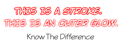 This post has been edited by Super Shanko: Jul 12 2014, 04:08 This post has been edited by Super Shanko: Jul 12 2014, 04:08 |
|
|
|
|
|
|
Jul 12 2014, 05:55
|
Alex68785
Group: Members
Posts: 342
Joined: 4-May 08
|
Tried both methods. I'm thinking just resizing it (though that makes it slightly inconsistent with the other text sizes but with that bubble being smaller is ok I guess?) looks better. That or I didn't do the stroke right. resize [ postimg.org] http://postimg.org/image/ie0vu2r63/full/stroke [ postimg.org] http://postimg.org/image/sy8rkh0wz/full/Thanks again for the info. There actually seems to be a ton of stuff to learn about this. I definitely have new found respect for releases. How is everything else? Especially page 9. The vertical bubbles filled with a bunch of text left me puzzled on how to do it. does the way I did it seem ok or is there a better way to go about it? Also any tips or tools to aid in redrawing bubble lines? It doesn't work very well with a mouse. Maybe it's just because I did it, but the shity job I did in page 10 seems to be glaring to me. This post has been edited by Alex68785: Jul 12 2014, 05:57 |
|
|
|
|
|
|
Jul 12 2014, 06:27
|
Super Shanko
Group: Members
Posts: 5,647
Joined: 29-June 08
|
Ohhhh, for that? Resize the text. Don't break the bubble unless you truly have to, that's my motto.
|
|
|
|
Jul 12 2014, 06:36
|
Alex68785
Group: Members
Posts: 342
Joined: 4-May 08
|
Did you by chance look at page 9? That's the one that gave me the most trouble out of the ones I did.
|
|
|
|
|
|
|
Jul 12 2014, 07:06
|
Super Shanko
Group: Members
Posts: 5,647
Joined: 29-June 08
|
Alright, I checked it out. The font you're using for it is way too thick, thus making it hard to squeeze into such a tight spot (perverse puns!). However, I see another problem, and that's the resolution is too high, which is again, the scanner's fault, and why your font size is like 3-5pt, right, making it a pain? I'll get to that in a moment. First thing I suggest is that you use a thinner font, like Indie Star (below), or something similar, which doubles for her weary voice; Also, after I placed and stacked the font, I tweaked it by Free Transforming it until I make it fit better instead of goofing around with the settings. 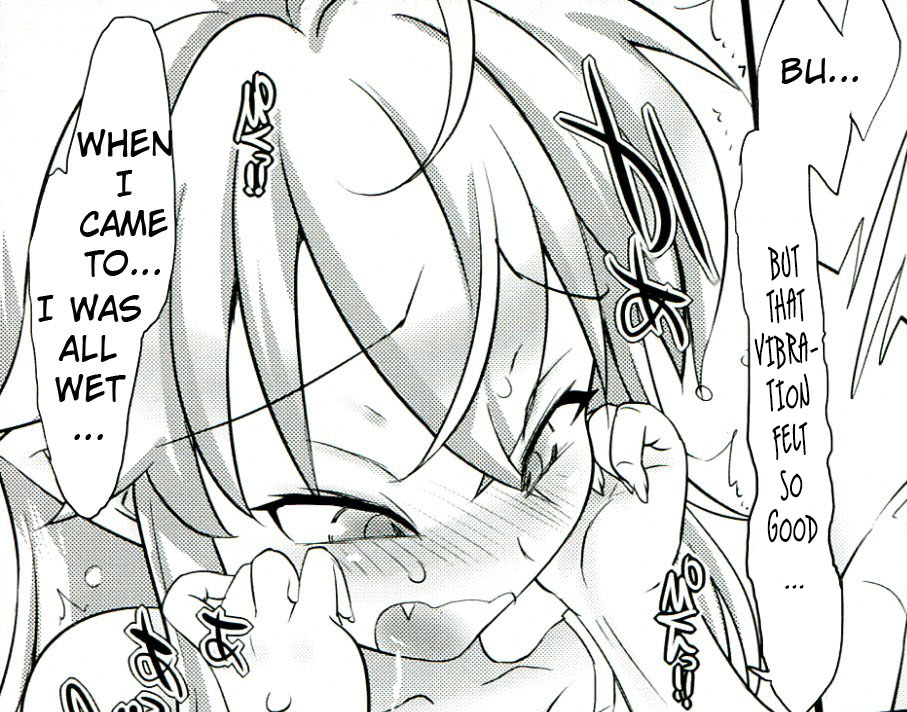 As for the problem with the resolution thing, you can change that by going to Image --> Image Size and unchecking "Resample Image" and changing the resolution to between 70-150; 600 is fine if your image is 6000x4000, but not for something much smaller. This post has been edited by Super Shanko: Jul 12 2014, 07:07 |
|
|
|
|
|
|
Jul 12 2014, 08:00
|
Alex68785
Group: Members
Posts: 342
Joined: 4-May 08
|
Yes. i was wondering why the hell most tutorials I saw say use a 10-13pt font but mine was giant at 3-4. Most of the bubbles were 3.5-4 if that matters. only indie star I'm finding is indie star BB which gets me this [ postimg.org] http://postimg.org/image/4r45z8mwt/full/ . I did multiple text boxes to achieve that. it definitely does look much better that way. And the resolution issue was driving me insane. Really thank you so much for all the help. Your awesome. |
|
|
|
|
|
|
Jul 12 2014, 08:18
|
Super Shanko
Group: Members
Posts: 5,647
Joined: 29-June 08
|
Oh, one more thing, under the character panel where it says Auto, that's the leading; by changing it you can thus stack the lines closer/farther apart like I had done on mine. When ever you get the chance, you should fool around with the Character panel and mess with it's settings; It's one of the most important tools for typesetting (being the tool panel for it) and makes a world of difference. Also if you use the Free Transforming method and lock/link the aspect ratio, you can change the fonts size without needing to meticulously change the pt size with decimals. It's especially good with smaller bubbles and so on. That's something I had to learn the hard way.
Side note: Damn, I should make my own guide! >_<
This post has been edited by Super Shanko: Jul 12 2014, 21:23
|
|
|
|
|
|
|
Jul 14 2014, 17:13
|
Red of EHCOVE
Group: Gold Star Club
Posts: 9,493
Joined: 28-April 07
|
QUOTE(Super Shanko @ Jul 12 2014, 01:18)
Damn, I should make my own guide! >_<
You've been saying this for years... |
|
|
|
Jul 14 2014, 18:06
|
Super Shanko
Group: Members
Posts: 5,647
Joined: 29-June 08
|
Yea, I know... (IMG:[ invalid] style_emoticons/default/dry.gif) Edit: I'm working on the damn guide. This post has been edited by Super Shanko: Jul 14 2014, 20:44 |
|
|
|
Jul 15 2014, 10:18
|
Alex68785
Group: Members
Posts: 342
Joined: 4-May 08
|
Finally finished a draft. Not sure if it's ok to post it here though, so I'll wait for red's approval.
Thanks a ton for all of the advice Super Shanko. Was a great help to a completely rookie editor. I'd love to see a guide from you too.
Looking back it's definitely been a huge learning experience. You sure do pick up a bunch of tricks even from just the first 10 pages. The last 5 were hell(holy fuck the difficulty curve) but it was actually an entertaining experience. Here's hopping I didn't do too shitty a job. The redraws annoy me so much lol.
|
|
|
|
|
|
|
Jul 15 2014, 14:16
|
Red of EHCOVE
Group: Gold Star Club
Posts: 9,493
Joined: 28-April 07
|
QUOTE(Super Shanko @ Jul 14 2014, 11:06)
Edit: I'm working on the damn guide.
Halleluiah (IMG:[ invalid] style_emoticons/default/tongue.gif) QUOTE(Alex68785 @ Jul 15 2014, 03:18)
Finally finished a draft. Not sure if it's ok to post it here though, so I'll wait for red's approval.
Totally OK. This post has been edited by Red_Piotrus: Jul 15 2014, 14:16 |
|
|
|
1 User(s) are reading this topic (1 Guests and 0 Anonymous Users)
0 Members:
|
 |
|
 |
|
|
|


