Loading. Please Wait... 
 |
 |
 |
 Editors water-cooler Editors water-cooler, The place to ask questions about editing |
|
|
 |
|
 Nov 7 2015, 00:21
|
HASJ2
Newcomer
 Group: Members
Posts: 59
Joined: 2-September 09

|
QUOTE(Super Shanko @ Nov 6 2015, 18:54) 
What is that? Manga Temple?
Yes, it is. Used it for narration only, though. QUOTE(Super Shanko @ Nov 6 2015, 18:54) First thing is that I do is use a more compact font like CCComicCrazy. Aside from that, minor things like have a distinguished font for both of them, but keep it uniform, with maybe an italic/bold for minor moans and "hmm..."s. I tried but I think the fonts aren't different enough. Will use a different for both of them. I thought about, but didn't seem right. Now it is. ;] QUOTE(Super Shanko @ Nov 6 2015, 18:54) Most important thing is to not break the lines like that. Like what? QUOTE(blue penguin @ Sep 15 2015, 16:20) ... 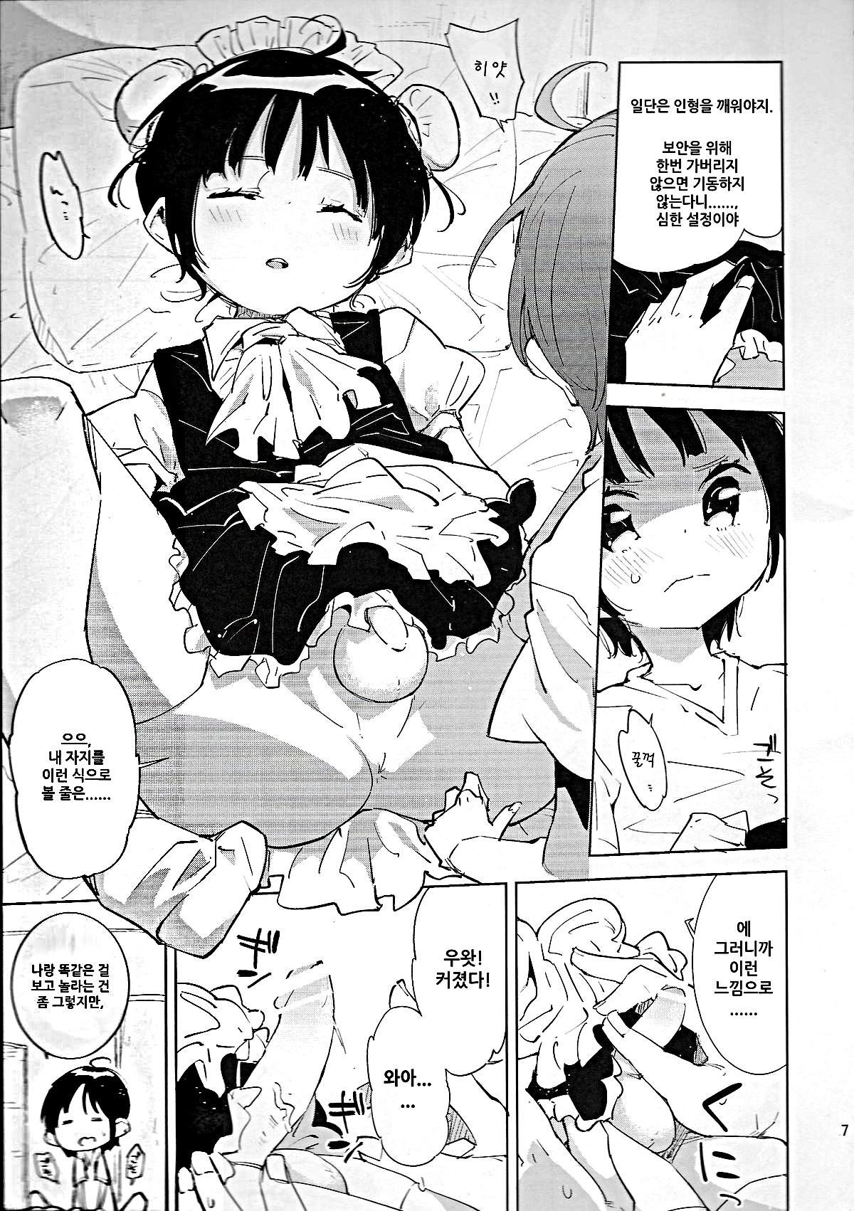 How would you guys go about cleaning that left side and those grey smudges? My arm started hurting just thinking about the way I'd do it: Zoom to 1000% and brush away... |
|
|
|
|
|
|
Nov 7 2015, 03:04
|
Super Shanko
Group: Members
Posts: 5,651
Joined: 29-June 08
|
That top right bubble on your above image is what I mean. If it's all meant to be one line of wording, keep it together, unless it's that side muttering.
As for smudging like that, well.... it's a bit of work. What I do is create a new layer and manually create new line work to match the original. If it's my own scans, then I make a pattern (pre-level) from a large chunk of "black" to lay over it. Once that's all done, just erase the bad stuff, flatten it and tell no one!
|
|
|
|
Nov 12 2015, 01:22
|
mrwayne
Newcomer
Group: Members
Posts: 71
Joined: 26-March 12
|
Does anybody know [ i.imgur.com] what font this is? it's not Bradley Hand ITC, though it looks like it. |
|
|
|
|
|
|
Jan 10 2016, 09:28
|
Superlatanium
Group: Gold Star Club
Posts: 7,667
Joined: 27-November 13
|
For a standard edit job without anything special like redrawing, usually 95% of my required time is spent copying the script's line into the text bubble, sizing the text bubble appropriately, adding line breaks to conform to the shape of the bubble, and then increasing/decreasing text size as appropriate.
Does anything exist that can make this process less tedious? What I would really like to be able to do is copy a line for a text bubble onto my clipboard, put the mouse over or magic wand the text bubble, and run something to type the text bubble and center it. Assuming the font and style is right, all that remains is to change the text size, and even that often won't be necessary.
I am fairly confident I could write something to do all of this at once, including detecting the general shape of the text bubble (rectangle? tall oval? flat oval?) and putting in appropriately positioned line breaks to generally maximize horizontal distance between the text edge and bubble edge (usually, fat diamond shape) - but I'd rather not reinvent the wheel unless I have to. The big issue is taking the shape of the bubble and outputing a similarly shaped block of text, everything else is mostly trivial. Anyone know if there's anything like this I could use as a starting point?
|
|
|
|
|
|
|
Jan 10 2016, 10:35
|
Super Shanko
Group: Members
Posts: 5,651
Joined: 29-June 08
|
Nothing that I know of other than making a text box. In most guides they have you just click to form your text line point and go from there bu let I've always just click/dragged to form the box, and use it to position it to the size of the text bubble. If you're not aware you can use the free transform to quickly resize your font as well.
|
|
|
|
Jan 18 2016, 19:16
|
tester12342
Newcomer
Group: Members
Posts: 82
Joined: 23-June 11
|
How would you guys go about handling cases like this? (IMG:[ i.imgur.com] http://i.imgur.com/jUqBqZI.jpg) It looks like the page wasn't fully flat when it was scanned and unfortunately there are no better raws available. Would it be better to leave them as is or is it better to edit them out? |
|
|
|
Jan 18 2016, 19:33
|
Superlatanium
Group: Gold Star Club
Posts: 7,667
Joined: 27-November 13
|
QUOTE(tester12342 @ Jan 18 2016, 17:16) How would you guys go about handling cases like this?
It looks like the page wasn't fully flat when it was scanned and unfortunately there are no better raws available. Would it be better to leave them as is or is it better to edit them out? You can use a series of leveling layers, possibly in combination with some dodging. It's not an uncommon problem. [ www.google.com] https://www.google.com/search?q=leveling+gutter+shadow |
|
|
|
|
|
|
|
|
|
Jan 30 2016, 01:46
|
hidden123
Newcomer
Group: Members
Posts: 53
Joined: 28-August 14
|
QUOTE(Superlatanium @ Jan 10 2016, 09:28)
For a standard edit job without anything special like redrawing, usually 95% of my required time is spent copying the script's line into the text bubble, sizing the text bubble appropriately, adding line breaks to conform to the shape of the bubble, and then increasing/decreasing text size as appropriate.
Does anything exist that can make this process less tedious? What I would really like to be able to do is copy a line for a text bubble onto my clipboard, put the mouse over or magic wand the text bubble, and run something to type the text bubble and center it. Assuming the font and style is right, all that remains is to change the text size, and even that often won't be necessary.
I am fairly confident I could write something to do all of this at once, including detecting the general shape of the text bubble (rectangle? tall oval? flat oval?) and putting in appropriately positioned line breaks to generally maximize horizontal distance between the text edge and bubble edge (usually, fat diamond shape) - but I'd rather not reinvent the wheel unless I have to. The big issue is taking the shape of the bubble and outputing a similarly shaped block of text, everything else is mostly trivial. Anyone know if there's anything like this I could use as a starting point?
Well.............. [ projectnaptha.com] https://projectnaptha.com/ does what you want, but its still in the early alpha stage and does not have a image save feature (unless you use print screen). There is a C++/matlab script that does some simlar stuff if you would like me to share it. I bring these two up because it makes me feel like that there are some photoshop plugins that might be useful for editors/cleaners/redrawers. Other than something that involves ocr, I guess technically you could try novels which don't require any cleaning or redrawing. Editing only involves a whole lot of grammar-nazi proofreading and word replacement for names. Typically editing a 240 page takes only 4-10 hours. It turns out that its is possible to convert a .pdf to image files and post them to e-hentai. The bottle neck is translation. This post has been edited by hidden123: Jan 30 2016, 02:19 |
|
|
|
|
|
|
Jan 30 2016, 04:06
|
Superlatanium
Group: Gold Star Club
Posts: 7,667
Joined: 27-November 13
|
QUOTE(Ser Maggot @ Jan 29 2016, 20:13) Hi. How do you guys deal typesetting with cut off bubbles? Same as with normal bubbles, I'd think, type text large enough to see comfortably while keeping a solid (and hopefully consistent) margin between the text and the bubble edge. In this case, the ideal shape of the text would probably look something like an upside down right triangle. QUOTE(hidden123 @ Jan 29 2016, 23:46) Well.............. [ projectnaptha.com] https://projectnaptha.com/ does what you want, but its still in the early alpha stage and does not have a image save feature (unless you use print screen). There is a C++/matlab script that does some simlar stuff if you would like me to share it. I bring these two up because it makes me feel like that there are some photoshop plugins that might be useful for editors/cleaners/redrawers. Other than something that involves ocr, I guess technically you could try novels which don't require any cleaning or redrawing. Editing only involves a whole lot of grammar-nazi proofreading and word replacement for names. Typically editing a 240 page takes only 4-10 hours. It turns out that its is possible to convert a .pdf to image files and post them to e-hentai. The bottle neck is translation. A very interesting site. Unfortunately, a problem is that vertical J text with similar character widths/heights is very different from horizontal Roman text (with different line-break requirements as well). But if the original page is well-typeset in a similarly styled language, that looks like it would work well. |
|
|
|
|
|
|
Jan 30 2016, 04:53
|
Super Shanko
Group: Members
Posts: 5,651
Joined: 29-June 08
|
|
|
|
|
Jan 30 2016, 09:05
|
Ser Maggot
Group: Members
Posts: 249
Joined: 14-June 12
|
@Superlatanium I tried the inverted triangle shape, it looks weird to me. I guess this will be the last thing I decide before I cap it off. QUOTE(Superlatanium @ Jan 10 2016, 15:28) For a standard edit job without anything special like redrawing, usually 95% of my required time is spent copying the script's line into the text bubble, sizing the text bubble appropriately, adding line breaks to conform to the shape of the bubble, and then increasing/decreasing text size as appropriate... Try this one: [ illuminati-manga.com] http://illuminati-manga.com/illiteracy/typesetterer/?p=About@Super Shanko Useful, thanks! |
|
|
|
|
|
|
Feb 19 2016, 05:25
|
svines85
Group: Gold Star Club
Posts: 19,685
Joined: 8-May 12
|
Does anybody happen to have any screentones they could share that might at least come close to something like this.....what, I guess I'd call this some kind of "plaid" pattern, right? [ i.imgur.com] http://i.imgur.com/pzJ6cQi.png |
|
|
|
Feb 19 2016, 05:53
|
tester12342
Newcomer
Group: Members
Posts: 82
Joined: 23-June 11
|
QUOTE(Superlatanium @ Jan 18 2016, 19:33) You can use a series of leveling layers, possibly in combination with some dodging. It's not an uncommon problem. [ www.google.com] https://www.google.com/search?q=leveling+gutter+shadowReally great help thanks. |
|
|
|
|
|
|
Apr 12 2016, 08:24
|
-The Dashing Dash-
Group: Gold Star Club
Posts: 853
Joined: 4-March 16
|
Hey there, I'm trying to practise editing. I decided to give this page a try https://e-hentai.org/s/8c5e3302a6/78627-13 I've had some problems with this page though 1) For some reason when I try to export, I only get the text 2) When I try to stroke, the text gets smaller because of the white outline (see the "Je t'en prie" in the middle) 3) I used wild words as a font, but since the translation is in French, it doesn't seem to support accents. Letters with them are displayed a littlle different (check É, panel 1, 2nd bubble; Ç: top left; È and É, last pannel) Anyone got suggestions? I used GIMP Thanks in advance 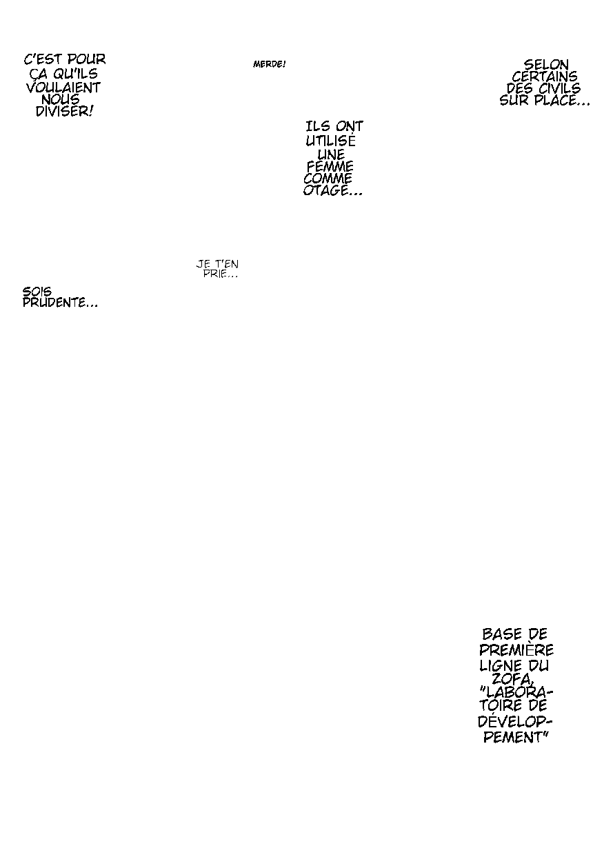 |
|
|
|
|
|
|
Apr 12 2016, 09:02
|
Super Shanko
Group: Members
Posts: 5,651
Joined: 29-June 08
|
I'm not an expert with GIMP, but I might be able to help... 1: Did you flatten the image? Because it sounds like you're only exporting one layer. 2: Check the settings to the stroke, because it sounds like you're doing an "inner" stroke. It needs to be outer. 3: (A)You're forced to use a different font; ((IMG:[ invalid] style_emoticons/default/cool.gif)I "think" there's a Wild Words with accents; ©What I do, I take a separate apostrophe and rotate it to make a faux accented character. For a suggestion, laffayette comic pro is a nice font that supports accented characters. |
|
|
|
|
|
|
Apr 14 2016, 03:09
|
-The Dashing Dash-
Group: Gold Star Club
Posts: 853
Joined: 4-March 16
|
Thanks for the reply. I downloaded Lafayette font. It does É, but for some reason, it does not support È and Ç (which won't probably be that frequent, but it still annoys me). I found this font:  What do you think about it? I worked out how to fix the other issues. Here's how I did it: For the image, I realized the only thing I needed to do was right click on the backround image and select "New from visible" I still don't know how to do an outer stroke. What I found out though is to duplicate the text layer, select "text to path" then set both background and foreground white, then stroke (which adds a layer of white to the text) and then put the original layer on top. |
|
|
|
Apr 14 2016, 03:12
|
Super Shanko
Group: Members
Posts: 5,651
Joined: 29-June 08
|
Hey, if it works, go for it.
|
|
|
|
Apr 14 2016, 11:52
|
rookie84
Group: Gold Star Club
Posts: 828
Joined: 23-June 08
|
QUOTE(-------------------- @ Apr 14 2016, 02:09)
I still don't know how to do an outer stroke. What I found out though is to duplicate the text layer, select "text to path" then set both background and foreground white, then stroke (which adds a layer of white to the text) and then put the original layer on top.
Another way is to download and install the layer effects plugin (click [ registry.gimp.org] here). Once you've selected the text layer, go to Layer > Layer Effects > Stroke. To avoid making your text thinner, set Position to 100. |
|
|
|
1 User(s) are reading this topic (1 Guests and 0 Anonymous Users)
0 Members:
|
 |
|
 |
|
|
|


