QUOTE(BMXArena @ Mar 8 2018, 23:42)

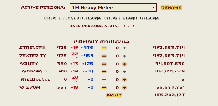
The additional attributes in the 20s range don't seem to fit.
It does that for me, too. Always has, you just get used to it after so long.
QUOTE(Scremaz @ Mar 9 2018, 01:35)
if you really want to go for the default font, the most similar one is Starcraft.
The HV font is already Starcraft.
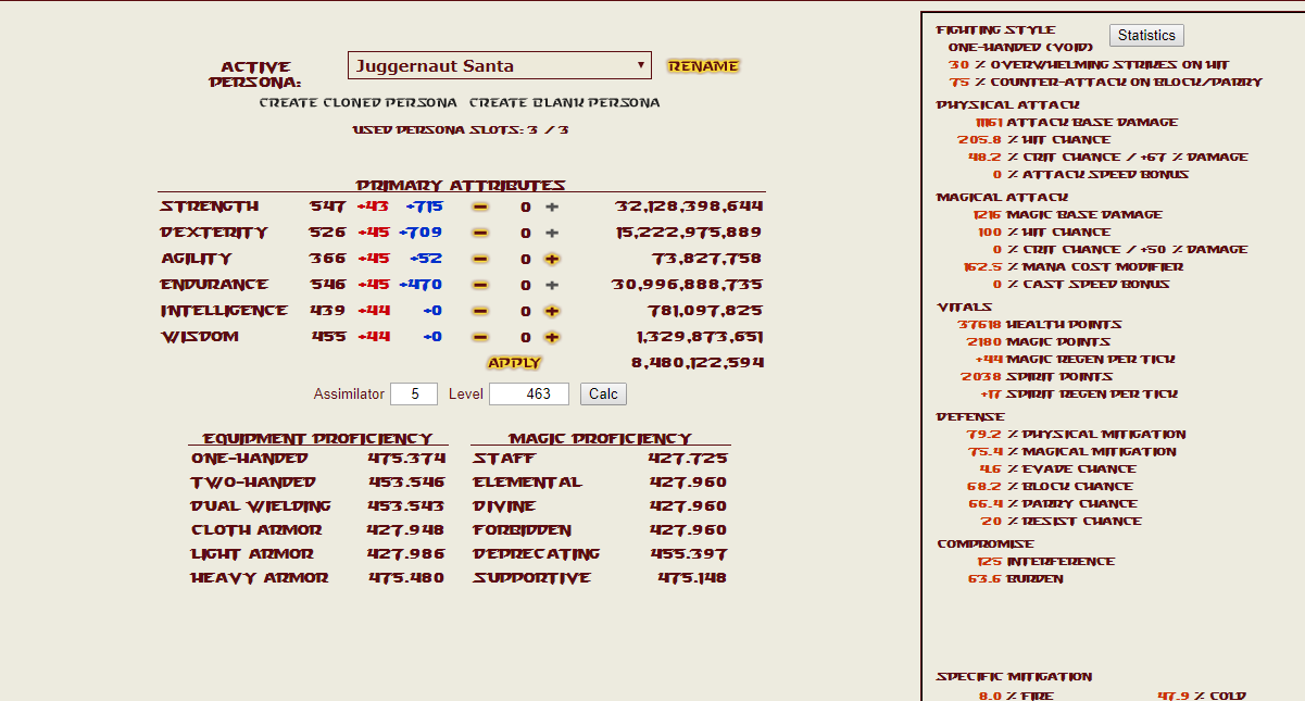
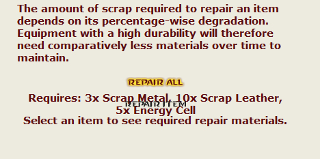
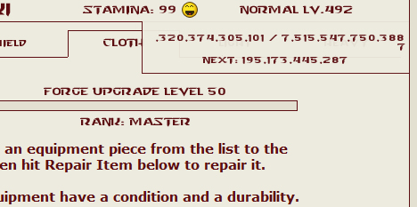
EDIT: After checking, I forgot it no longer overlaps with the numbers on the character page for me. I have the font size at 6 and then adjusted everything with NoSquint. It still overlaps on the repair page.
And when I hover over the level for the EXP.
 This post has been edited by Sesshomaru Moon: Mar 10 2018, 02:39


 Mar 9 2018, 11:42