Loading. Please Wait... 
 |
 |
 |
 The Critique The Critique, For those in search of perfection |
|
 Jun 15 2012, 14:14
|
Muramasa777
Group: Gold Star Club
Posts: 5,978
Joined: 9-January 09

|
The main essence of this thread is quite simple. People post drawings (drawn by themselves, obvious is obvious), and other people criticise it: it means, telling bad things, but also good things. Notes: - I am responsible of my own opinions but not third parties. - Don't post only things like "Excellent" or "Sucks" (this is what personal threads are meant for), explain why you like something or why you don't like something; most times, styles make the difference. - If you think something is going to be butchered to pieces, don't post. It wastes your time and my time- lose-lose. Use this time to improve. - Always look at the bright side of life. (More notes to come if necessary) START! (Let this thread live or send it to the forum depths) INDEX: lusterjoker LJ-0001Muramasa777 M777-0001M777-0002M777-0003M777-0004Malkuth Malk-0001, Malk-0002, Malk-0003This post has been edited by Muramasa777: Aug 2 2012, 00:31 |
|
|
|
|
 |
|
 Jun 15 2012, 21:58
|
BrainSucks
Group: Gold Star Club
Posts: 11,171
Joined: 11-October 08
|
That's a very good idea, (depends of the critiques of course) that method could awake some sensibilities & see things with more positive way. I hope this thread will turn out well (IMG:[ invalid] style_emoticons/default/happy.gif) |
|
|
|
Jun 15 2012, 22:01
|
Raaby
Group: Gold Star Club
Posts: 14,187
Joined: 16-February 09
|
I kind of like the idea of an actual critique thread, providing people can actually offer real opinions rather than QUOTE(edson @ Feb 7 2010, 14:21) 
wow u r talent...i like u style
|
|
|
|
Jun 15 2012, 22:06
|
Muramasa777
Group: Gold Star Club
Posts: 5,978
Joined: 9-January 09
|
QUOTE(BrainSucks @ Jun 15 2012, 21:58) That's a very good idea, (depends of the critiques of course) that method could awake some sensibilities & see things with more positive way. I hope this thread will turn out well (IMG:[ invalid] style_emoticons/default/happy.gif) Well, if you have seen any critique by bakabombdood, this thread is thought to be like that. |
|
|
|
 Jun 15 2012, 22:22
|
BrainSucks
Group: Gold Star Club
Posts: 11,171
Joined: 11-October 08
|
QUOTE(Robbie Pie @ Jun 15 2012, 23:01) QUOTE(edson @ Feb 7 2010, 21:21)
wow u r talent...i like u style
Oh god... no! QUOTE(Muramasa777 @ Jun 15 2012, 23:06)
Well, if you have seen any critique by bakabombdood, this thread is thought to be like that.
I have & I hope we gonna get more people with critique like his. |
|
|
|
Jun 15 2012, 22:50
|
bakabombdood
Group: Members
Posts: 584
Joined: 10-March 11
|
A critique thread, a place I could get used to posting on regularly, I approve!
|
|
|
|
Jun 15 2012, 23:06
|
lusterjoker
Group: Members
Posts: 1,363
Joined: 7-January 11
|
fine let's start this is my old drawing from last year...just made some little changes (IMG:[ i2.lulzimg.com] http://i2.lulzimg.com/7a439e5ff6.png) go on...I still have free times until tomorrow |
|
|
|
|
|
|
Jun 16 2012, 00:26
|
bakabombdood
Group: Members
Posts: 584
Joined: 10-March 11
|
QUOTE(lusterjoker @ Jun 15 2012, 23:06)
fine
let's start
this is my old drawing from last year...just made some little changes
go on...I still have free times until tomorrow
Alright lets start with the good parts of the drawing. First thing that stood out to me was the face, you drew her incredibly well (Her expression is rather intense, something I like to see with female characters) - you compensated for the angles of her face and drew her hair exceptionally. Your character from the beginning of the ribcage and up was drawn solidly, especially given the slight twist of her pose. Hips, thighs, and groin areas seem draw anatomically accurate. The definition in all the previously stated areas is outstanding, and the suit/armor/equipment doesn't clash with her proportions. ----- Some of the more questionable things. The jet pack on her back is draw fine, but is lacking some detail, it seems almost free floating and independent from the character, I think it would be best to show it somehow anchored/attached/linked to the character (unless you intend for that piece of equipment to be independent of the character...). Another small issue is her left arm, while everything is drawn well, the angle looks a tad too exaggerated, this makes her elbow seem in a slightly unnatural position - as if her arm was moving so far back that her elbow joint could snap. Correcting this would involve moving her arm slightly "forward" giving the character a more natural bend at the elbow. ----- Some areas needing improvement the area around the right arm and thigh are a little too cluttered, it is rather difficult to tell what those objects are, the thigh seems to have some sort of holster or radio attached, in her hand is (I'm assuming) holding a helmet. I'm having a difficult time determining these objects due to how close her arm is to her thigh, you may want to raise the arm so that the objects are clearer, or at least make note of what those objects are by writing notes (or if this is in a comic book/manga, have another drawing show these details so that the viewer has some reference to use with the character). Lastly is the stomach (or core of her body) area, to me it seems as though the character is somewhat chubby (though that is still attractive), I assumed you meant to show her core as developed? If so, it may be better to add more muscle definition to her abdominal area. If you were attempting to show her core as sleek and thin, it would be better to redraw the line between the lower right side of the rib and slightly above her right thigh closer to her abdominal area in a reverse "c" curve (I recommend against this, as her proportions could potentially make her look malnourished/starved). Again I'm really unsure of this area, for all I know her skin tight suit is actually armor designed to look like that (if that's the case I really need some sort of background of the character and her equipment, either through story/note/and the such). --------------------- Overall I have to say this is a rather good piece of art that has only minor errors, I'd love to see a finished colored version of this joker, glad you took the time to post your work, I look forward to seeing more. |
|
|
|
|
|
|
Jun 16 2012, 04:59
|
lusterjoker
Group: Members
Posts: 1,363
Joined: 7-January 11
|
as expected that was good critiques thanks for pointing the point that indeed make this drawing looks off but...got to wait after I'll get back first (IMG:[ invalid] style_emoticons/default/biggrin.gif) |
|
|
|
|
|
|
Jun 30 2012, 14:22
|
GlanceReviver
Newcomer
 Group: Members
Posts: 77
Joined: 8-August 11
|
I will not say much for the hair/face due to its stylization which is up to personal taste. I would prefer more detail in the hair, eyes, and nose, but that's a preference. Drawing the torso muscles in a twisted position is tricky. I suggest drawing a line that marks the center of her body. Make sure you get the dent from her belly button and such. Then draw horizontal lines across, following the twist, denoting the separation of the muscles. From there you can define the muscles. I like this reference: [ snigom.deviantart.com] http://snigom.deviantart.com/art/Female-An...tterns-43675502But you can find whichever approach makes sense to you when drawing the muscles by trying different tutorials. The hips bones are not high enough on the body, and they also pinch in too far. The topmost part of the hip will be about the same line as the belly button, and the widest part of the hip is nearer to the crotch. Try drawing the body without the breasts first. When the breasts are over-sized, it can obscure parts of the body that are important to figuring out the anatomy. Most people want to draw the boobies first. XD This post has been edited by GlanceReviver: Jun 30 2012, 14:24 |
|
|
|
|
|
|
|
|
|
|
|
|
|
|
|
Jul 3 2012, 17:20
|
BrainSucks
Group: Gold Star Club
Posts: 11,171
Joined: 11-October 08
|
1* Anatomy is fairly good, but there's something wrong with the ear. Her left knee is too long (based
on angular view) & left foot is pointing to the wrong direction, it should turn to the left by 90°.
2* Same comment for the ear. The chest, head & left arm are excellent. The right arm however has some
mistakes: upper arm & forearm are kinda ok, but the hand seems like it's rotating too much down. And the
legs should be a little bit lower, 'cause I can barely see the hips & belly.
3* Good anatomy. I won't comment for the rifle, 'cause you obviously draw it with some haste. The hairstyle
could be better & you shouldn't add that strong line on her jaw.
All* Good lineart & nice colors. The details still need some work though.
====
Keep it up Mura, I wanna see MOAR!
And have a nice trip (again, by me) ^^
|
|
|
|
|
|
|
Jul 4 2012, 08:17
|
Negative Man
Group: Members
Posts: 1,096
Joined: 15-March 12
|
QUOTE(Muramasa777 @ Jul 2 2012, 16:40) I like this one, but I think the shadows are way too dark, just changing the opacity and blending mode of the shadow layer should lead to more subdued forms. I did just that with the layers you posted in your other thread, because I'm a disrespectful man: 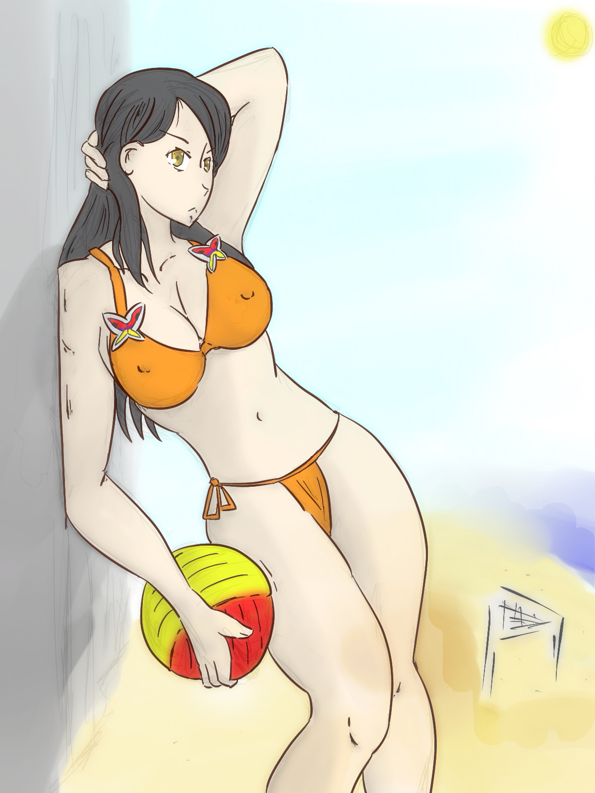 This post has been edited by Negative Man: Jul 4 2012, 08:20 This post has been edited by Negative Man: Jul 4 2012, 08:20 |
|
|
|
Jul 9 2012, 03:34
|
Peruvous
Newcomer
Group: Members
Posts: 26
Joined: 9-July 12
|
Very nice ^^
|
|
|
|
Jul 29 2012, 01:43
|
Muramasa777
Group: Gold Star Club
Posts: 5,978
Joined: 9-January 09
|
|
|
|
|
Jul 29 2012, 10:22
|
BrainSucks
Group: Gold Star Club
Posts: 11,171
Joined: 11-October 08
|
Full analysis? Excellent facial expressions, good line art (as usual) & anatomy has improved a lot.
The only mistake I'm seeing is (forgot her name) bow girl's right hand, the index finger looks fat :]
Coloring seems unfinished, so I can't say my critique on that.
P.S: Would you believe me that the bonus chapter I'm preparing for d-project, involves pokemon?
|
|
|
|
Jul 29 2012, 13:54
|
Eirhjien
Group: Members
Posts: 470
Joined: 9-July 11
|
more of a "try this and see what magical suprise awaits" things...
first, try shading with color.... instead of shading the gray hair with black, try dark purple. when you do the skin, try a dark red, or blue in the case of the beach pic.
tech one, use a solid edge brush instead of the soft one your using, keep the opacity you got going; BUT go into you brush options and turn "fade" on, maybe at 15-25 steps.
|
|
|
|
|
|
|
Jul 29 2012, 18:36
|
Negative Man
Group: Members
Posts: 1,096
Joined: 15-March 12
|
I recall you making a similar pose before, but this time it came much more "natural", it's neat when practice pays off(sounds obvious, but one of the things I've learned lately is that when you're learning, things end up looking better if you do them twice). About the fat fingers, I think european comics tend to be like that(Wakfu, for example), but like Brain said, you can't be inconsistent and make a finger fatter than the others for no reason.
|
|
|
|
1 User(s) are reading this topic (1 Guests and 0 Anonymous Users)
0 Members:
|
 |
|
 |
|
|
|


